Now that may sound patronising to grandmothers. However, in this instance she merely represents the everyman (or woman). Good signage should require no special or esoteric knowledge. You should be able to quickly navigate from any given point to any other point within the system at all times.
The art of wayfinding
Signage is just a method of aiding wayfinding, the process by which human beings orient themselves within - and navigate through - their environment.
We have evolved to be really good at this, so we tend not to think about it too much. The only time it enters our mind is when we get lost, or when we enter a novel, complex environment. This where signage becomes helpful, and in some cases crucial.
There are subtleties to signage that most of us never have to consider. Take motorway signs. They have the specific problem that they have to be read at 70 miles an hour. One of the cleverest ideas that British road sign designers made was to use lowercase letters for place names. This is because when we see a sign saying Bristol, we recognise the shapes of the letters rather than actually read the text. The brain then does the rest. This is much harder to do with capital letters because they form a visual rectangle as in BRISTOL.
Another part of the designer's art is to know when should use symbols rather than words. Some signs are better represented using images because of language barriers - toilets and rest rooms being the perfect example.
Beautiful versus functional
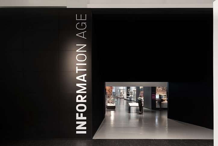
Signage is one of my favourite design disciplines because there is no real trade off between function and aesthetics. Your sign and directions can be useful and beautiful at the same time. The science museum with it primary colours, custom typeface, and integrated design is a great example of this.

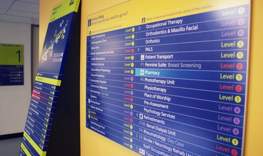
But it's the efficiency of signage which makes the difference between success and failure. Nowhere is this more evident than hospitals.

Hospitals are different to most complexes. In a shopping mall or museum, bad signage might cause confusion and delay. In a hospital bad signage might potentially cost lives. The task is usually complicated by the fact that many hospitals were not designed with this in mind. They are often an amalgamation of buildings that grew around the original hospital. They might have been formerly used for other things and then repurposed as hospitals. Only the most modern hospital buildings are designed with the flow of people incorporated into their actual design.
The word "hospital" comes from the Latin hospes, meaning stranger or guest. The word hospitality comes from the same root. My last visit to a hospital involved visiting six different parts of the building and lasted nearly 24 hours. I didn't get lost once and I don't think I am particularly good at navigating spaces.
In the end it all comes down to balance.
The NHS designed their signage with all the right techniques. Colour coding; lowercase lettering; widely spaced lettering (easier to read at a distance); words reversed out of colour panels; desaturated background colours; judicious use of symbols and an excellent use of directional arrows.
The trick is to balance out all of these various elements to produce a coherent message to the patient.
So the next time you are wandering the halls of your local hospital, shopping centre or museum, give a thought to the unsung heroes who are guiding you on your way.