The first of these pubs in need of a website was the Ship Inn in Highley. The Ship is both a pub and a hotel with several single, double and family sized rooms. Despite being a very old pub, the ship has a modern open feel to it so I wanted the design to reflect that.
A good website will not make a bad pub better. On the other hand, a good pub should not be let down by it's website. The Ship is a modern Inn with very traditional values. Good food, good service, and a warm and friendly ambience. That's not my opinion. The Ship's customers are very clear on the matter.
The signage for the pub used the typeface Copperplate Gothic, which I thought was an excellent point to start from, being a very distinctive font. However, Copperplate didn't really work online, with it's delicate vertical serifs. So I went looking for an established web font with a complimentary look. I choose Monserrat due to it's character with and open readable nature.
I was only going to use the typeface for headlines until I realised that it worked really well for body copy as well. The only exception to Montserrat was the quotes at the head of each page which needed a more organic look. I settled on Water Brush which balances readability with a beautifully handwritten feel.
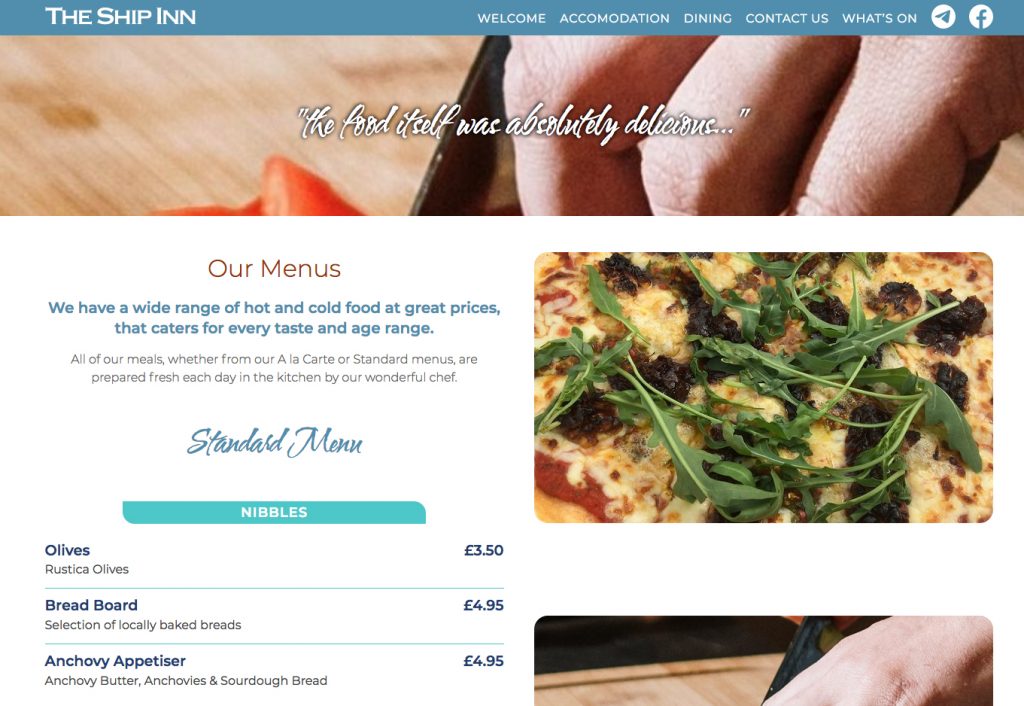
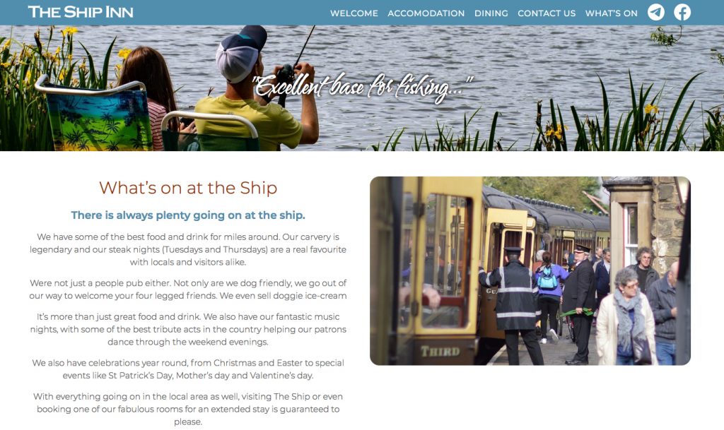
The Ship has an excellent reputation online, so I used various testimonials as page headers.
Once the Ship had been completed, I moved on to the second of the of the two pubs in need of a website - The Harbour Inn in Arley.