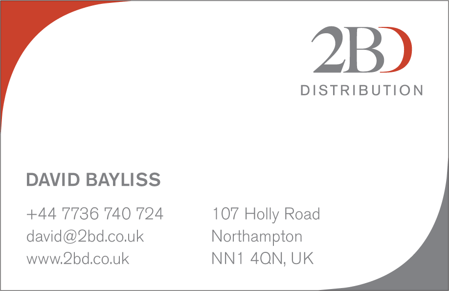
The usefulness of a business card is beyond doubt. A good business card works hard for you and your enterprise. It creates an impression and imparts a lot of useful information all condensed into 85 x 55 mm. For 2BD, I wanted to work with a purely typographic image that would be immediately recognisable while saving the rear of the card for all of the necessary corporate details.

My preferred solution was to do something that you rarely see on a business card, a photograph. Failing that I wanted to reduce the typographical elements until they became a purely graphic entity.
The client drew the line at the idea of a photo on the back of the business card so text as graphic it was.
I ended up overlaying the characters on top of each other and then enlarging them. This meant that they were severely cropped at the edge of the card.
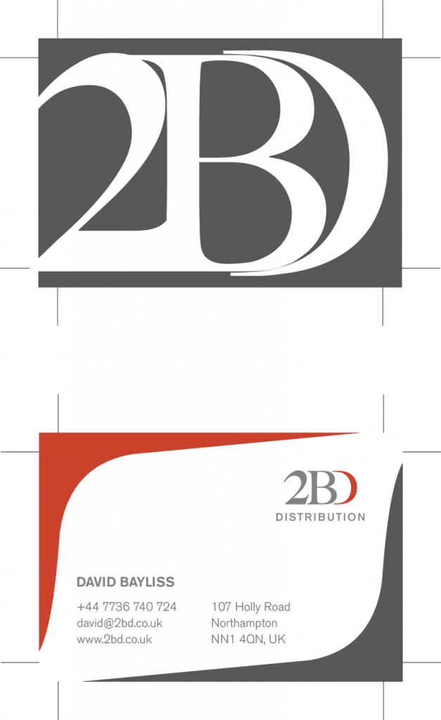
The graphic flourish on the information of the card came about as a happy accident. I initially wanted to have those bleeding off the corners of the card. However the client didn't really like the visual. When I was tried to delete them from the artwork I ended up reducing them by accident.
This resulted in the basis of the final image with the two corners framing the text.