Springfield Park Cafe – An ongoing project about trees

It seems that every culture loves trees. Some even worship them. Trees spring up in myths, legends and religious text with remarkable frequency. Whenever someone wants to highlight the beauty to be in found nature, the phrase "look at the trees" is often used, and there are few better places to do this in London than from the Springfield Park Cafe.

Create an A5 print booklet cataloguing the varieties of trees found in Springfield Park, East London.

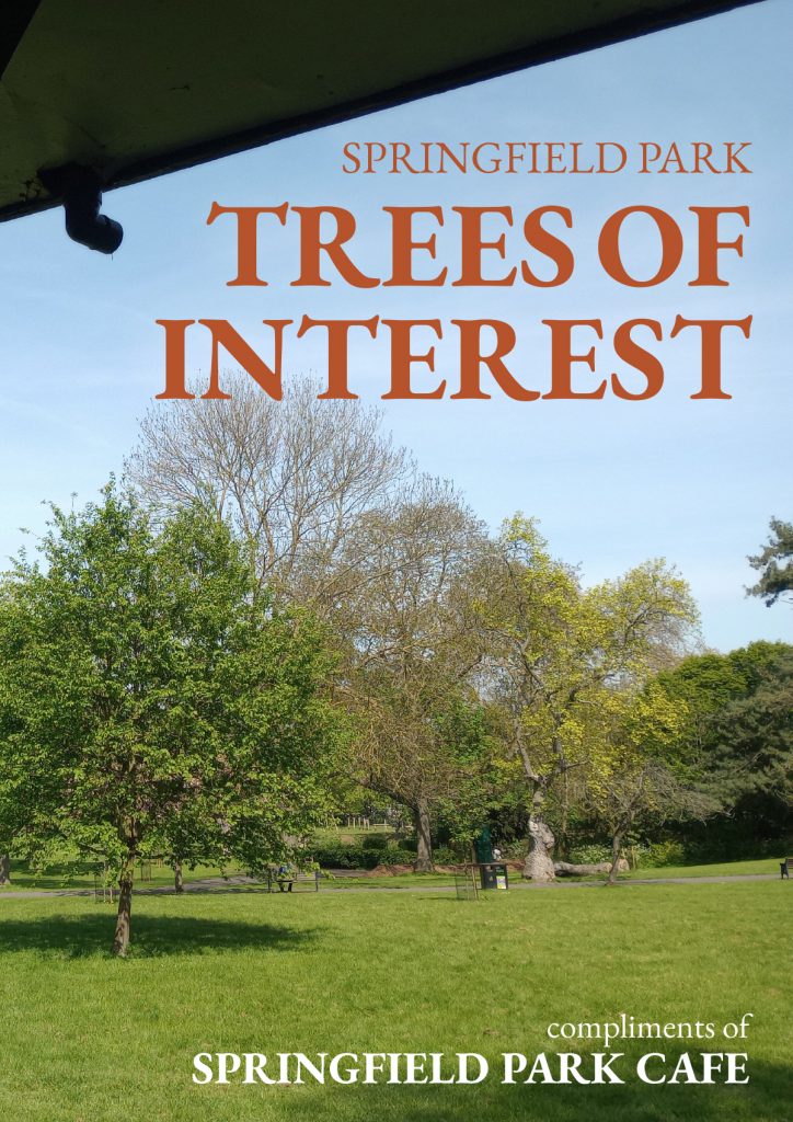
It's hardly surprising. Trees are gorgeous. So when the proprietors of the Springfield Park Cafe in East London asked me to update their booklet which showcases all of the trees in the enclosing park, I was happy to take the job.

Springfield Park Cafe

Because not every job is like this. I have created print and web design for some very unappealing items. One of the first jobs I ever had back in the late eighties involved creating a catalogue for a medical facility who specialised in incontinence. Trying to find the aesthetics in that job was a real challenge.

Because this was a redesign, the elements of the previous brochure where more or less set. There would be minimal editorial input and the job would be to reinterpret the material.

Springfield Park Cafe

Unusually the first thing to do was just wait. The brief was given to me in the depths of winter and I needed a sunny day in Spring in order to wander around the park with my camera.

Once I had acquired the photography that I needed the next thing to do was come up with a concept. My main concern with the previous edition was that it had not been designed to fit the medium. The booklet is only A5 and as such the large amounts of text were rendered in a somewhat cramped fashion.

This was not a problem which would ever be completely overcome. However, by eliminating excess clutter on the pages and using the differences in type to set the boundaries between data entries, I managed to clean up the layout and giving the text on the catalogues some breathing space.

SEO driven content – design and copy for HD Storage Solutions

Creating a website for a Transport and Warehousing company based in the Midlands characterised by SEO driven content.

Open Sans is possibly the most versatile typeface on the web

You have to admire someone who sets up a businesses during a global pandemic. This is exactly what HD Storage Solutions did in 2021, setting up a combined transport and warehousing facility near Coventry. This was one of the first projects where the need for SEO driven content was a requirement from the start.

This project began as a blank sheet. As assets go went there was a logo and that was it. No images, no copy and no real idea of how to balance the two parts of the business in marketing terms.

My biggest asset on the job was the client himself. He was open-minded and willing to listen. Moreover, he was happy for me to write the copy and to design the site with SEO as the primary driver.

Just my type

I have wanted to use Open Sans on a project for a while and this was the perfect opportunity.

Open Sans is a work of art. It can used with equal effect for headings, text, menus, buttons, and everything in-between. You can't say that about every typeface. It even works in all caps for the headlines, something that I am normally reluctant to do because it can appear to be somewhat aggressive.

Imagery came from a variety of sources. Transport by its very nature is a dynamic enterprise so the idea was to represent the idea of movement throughout.

SEO driven content

I no longer use or encourage sliders for home page content. However, I did like the idea of rotating the underlying image at the top of the home page while keeping the copy static.

In accordance with Google's preference, I have completely moved away from the idea of single page sites. That said, a home page should contain some essential information from each section of the site. This lead to creating the horizontal content bands that run down the page with SEO driven content from each section presented in each one.

Social Media Templates for Gradient Racing – layers upon layers of design

Gradient Racing are a motor sports team with an all female driver roster. They currently compete in the IMSA WeatherTech Sports Car Championship. They came to me before the start of the current season, looking for an adaptable series of social media templates.

A design style entirely inspired by the stunning car livery

The client was looking for a number of different social media templates in different sizes Portrait (1080 x 1920 pixels), Square (2025x2025 pixels), and Landscape (1920 x 1080 pixels).

Social Media Templates - 1 x 1

We used the size above to crate social media templates for Instagram, Twitter and Facebook.

In addition, we produced the templates as layered files in Photoshop which covered:

  • Quotes
  • Race schedules
  • Qualifying results
  • Race results

I was initially inspired by the creative work for the car livery. The car was covered in a chaotic fractal pattern of various shades of green and black on a white background.

Social Media Templates - 16 x 9

Inspired by the triangular shapes, I used a series of similar overlapping three sided shapes to mark out the separate areas of each template. Additionally, I used a similar diamond pattern of transparent white layers overlaid on images of the car for the text area.

In the end the multi layered look proved to be extremely effective. Moreover, it has become something of a signature look for the agency that commissioned me.

Pubs in need of a website – Part 1: The Ship in Highley

I was approached by a friend of a client who had been let down by their web designer. She had two pubs along the Severn river, both of which needed websites.

A pub in need of a website

The first of these pubs in need of a website was the Ship Inn in Highley. The Ship is both a pub and a hotel with several single, double and family sized rooms. Despite being a very old pub, the ship has a modern open feel to it so I wanted the design to reflect that.

A good website will not make a bad pub better. On the other hand, a good pub should not be let down by it's website. The Ship is a modern Inn with very traditional values. Good food, good service, and a warm and friendly ambience. That's not my opinion. The Ship's customers are very clear on the matter.

pubs in need of websites

The signage for the pub used the typeface Copperplate Gothic, which I thought was an excellent point to start from, being a very distinctive font. However, Copperplate didn't really work online, with it's delicate vertical serifs. So I went looking for an established web font with a complimentary look. I choose Monserrat due to it's character with and open readable nature.

I was only going to use the typeface for headlines until I realised that it worked really well for body copy as well. The only exception to Montserrat was the quotes at the head of each page which needed a more organic look. I settled on Water Brush which balances readability with a beautifully handwritten feel.

pubs in need of websites

The Ship has an excellent reputation online, so I used various testimonials as page headers.

Once the Ship had been completed, I moved on to the second of the of the two pubs in need of a website - The Harbour Inn in Arley.

Redesigning a website – Welchome Furniture in Chelsea

Redesigning a website for a high quality Italian furniture retailer.

Minimalism is essential to highlight the quality of the products

Welchome are a Chelsea based, Italian furniture outlet specialising in ultra-high quality home furnishings. They also offer a successful bespoke design service for business and residential interiors. There are many reasons for redesigning a website. In Welchome's case it was simply that the nature of websites had changed drastically since their previous design.

When I audited their website I found a number of issues. The existing site had been designed six years previously and was visually dated and cramped. The existing site was only partially responsive and the content management system was extremely limited.

The brief was to create a site that would present the visual quality of their products in a far more appealing fashion. They also required a comprehensive, yet simple Content Management System as they were continually updating their online catalogue with new products.

We highlighted the need to remove the cramped and visually chaotic elements. I stripped back the design and recreated the layouts as white backgrounds with minimal design. Myself and the client agreed that the site required a new font and installed Raleway, a light elegant geometric web font. The colour scheme was mostly comprised of neutral greys designed to place greater emphasis on the excellent product photography.

On the home page, I installed a full width carousel which uses the highest resolution images possible. The sheer quality of Welchome's product range shined through as a result.

We started with WordPress as a basic Content Management System. I added a number of additional fields and tables to allow for control of products, interior design, news and catalogues.

INHOUS Letting – an example of third stage corporate design

What is third stage corporate design? In corporate design stage one normally refers to establishing the brand elements such as logo, colours, and typefaces.

Sometimes working within restrictions brings out the best in your creative instincts

Stage two usually involves the creating the client's primary visual assets, business cards, documentation, letterhead, website, email signatures, etc.. The designer leverages the brand assets in a visually creative way but also maintains the integrity of those elements.

third stage corporate design

The third stage comes once all of those assets have already been established.

One one hand, this is less of a freely expressive exercise than stage 1 and 2. On the other hand it requires a different kind of creativity. You still have to come up with solutions that are visually arresting, communicate well, and remain faithful to the brand guidelines.

third stage corporate design

Inhous are a specialist property brokers operating in the UK and Ireland. They deal with highly valuable properties requiring specialised skills and knowledge alongside a great deal of discretion.

INHOUS decided to move into lettings alongside their existing sales service. As a result, they asked me to create layouts for letting out multiple properties.

There wouldn't be a lot of content given the expensive nature of the properties that they were offering.

I respected the established corporate identity (as every good designer should do) by keppeing to the existing website layout, colours and typography. Within those guidelines, I created an alternating layout that presented the properties in the best light. I was careful to remain consistent with the rest of the site while creating the new layouts.

Content updates – Rebel Rock Racing

Content updates are like a middle child, much loved but sometimes neglected. Content management systems are supposed to put content updates and creation in your client's hand. But simply having the tools is not enough if you don't the time or the basic skills required.

Why even the smallest of jobs can be disproportionately important to both you and your clients

This is a point that is universally true. Having a scalpel won't make me a surgeon, and owning a saw won't make me a cabinet maker. Just giving a client the keys to WordPress will really help them with content updates. They will also need a lot of skills that I take for granted.

  • Copy-writing
  • Asset acquisition
  • Editing
  • Layout
  • Photo editing
  • Knowledge of wordpress
  • A basic IT skill-set

And most importantly, the one thing that requires a bullet list all to itself.

  • Time

Many of my clients don't have the time or even the inclination to learn this, so they end up by asking me to do it and I am always happy to oblige.

content updates

The Rebel Rock Racing website needs regular but infrequent updates. It involves putting in a news story, a little bit of formatting, and finally adding the story to the homepage carousel.

It's a 10 minute job for me but a much longer task for my client.

The point of all this is that there is value in knowledge. It speeds up processes and enables you to present a guarantee to clients. Every story I put online quickly and accurately just adds incrementally to the most important aspect any client agency relationship, which is trust.

Alitrac – Packaging

Creating a design from a packing template for a personal alarm.

Packaging is unlike every other type of graphic design in its sheer complexity.

Alitrac is a branding vehicle for BD Networking. Their first product was a rebranded personal alarm, combining an ultra high sound emitter with a flashing LED. The device would be perfect for vulnerable people travelling in potential hazardous areas or situations. Creating a design from a packing template was the main part of the brief but before I could do that I needed a logo.

Creating a design from a packing template

Packaging comes with a unique set of challenges. Packaging projects are visually dense, with a huge number of elements needing to be incorporated into a relatively small space. This makes the potential for getting the visuals and the messages lost in the sheer overload of information compressed in such a small space,

Balancing these elements while maintaining visual impact is the needle that you have to thread.

Creating a design from a packing template

I created the packaging using colours that were sympathetic with those of the main retailer, Lloyds Pharmacy. I received some assets from the product supplier, such as the product images and a few sales shots. They also helpfully supplied an accurate die-line for the artwork

In the end I used a graphic silhouette of the egg shaped product as a starting point.

Building a website and a brand at the same time – Mobile Wheel Clinic

Mobile Wheel Clinic is a collaboration between one of my existing clients and a diamond wheel cutting specialist in the midlands. Building a website and a brand at the same time is not ideal but it can be done.

When what you want is a website but what you really need is a logo

They came to me asking for a website. However, they also needed a corporate Identity. They didn't even have a logo at that point. So the situation required building a website and a brand at the same time.

One lesson that has stayed me for years is that a good design embodies one idea and one idea only. After a couple of false starts I realised to me that the logo should be sharp and aggressive. The company's main service is repairing wheels using a diamond sharp cutting blade mounted on a lathe and the logo had to reflect that.

So the logo became a visual expression of sharpness, and needed to be forcefully presented.

Building a website and a brand

So I went with Jost, a typeface based on Futura. It's a geometric sans serif with very sharp lines and angles. This was perfect for the Logotype. The next idea was to take the company's initials and cut sections of the lettering off. Given that cutting was the core of the company's offer, this seemed appropriate.

Building a website and a brand

Finally I continued with the aggressive approach and went with black and red for the corporate colours. The client was very happy with this as they had found the alternatives to be somewhat insipid.

Building a website and a brand

Once the Logo had been approved, I was asked to help with the livery for the company's main vehicle. This van would be their base of operations and as such, would be useful for advertising and brand building.

I took the idea of sharp edges and created a design underpinned by a blade running the length of the van. The most difficult thing was making sure that every aspect of the design would fit in with the various parts of the vehicle. Eventually we balanced all of the elements and the livery was complete.

Building a website and a brand

This was the first opportunity to employ the logo out in the wild, as it were. I was very happy with the results.

Once I had delivered the van artwork, I returned to working on the Website. The curved blade graphic that I had used for the van turned to be an ideal fit for the website as well.

Building a website and a brand

This allowed me to use a lot of diamond cut wheel imagery as background images. The images give each page its own character.

As has become increasingly common, I ended up writing all of the copy for the site as well as designing and coding it.

2BD Corporate ID – The usefulness of a business card

Corporate identity, like so many things, has become increasingly focussed on the digital aspects of branding. That said, for small business and especially start-ups there is still a lot to be said for the usefulness of a business card.

Abstracting typography until it becomes graphic rather than text

The usefulness of a business card is beyond doubt. A good business card works hard for you and your enterprise. It creates an impression and imparts a lot of useful information all condensed into 85 x 55 mm. For 2BD, I wanted to work with a purely typographic image that would be immediately recognisable while saving the rear of the card for all of the necessary corporate details.

My preferred solution was to do something that you rarely see on a business card, a photograph. Failing that I wanted to reduce the typographical elements until they became a purely graphic entity.

The client drew the line at the idea of a photo on the back of the business card so text as graphic it was.

I ended up overlaying the characters on top of each other and then enlarging them. This meant that they were severely cropped at the edge of the card.

The graphic flourish on the information of the card came about as a happy accident. I initially wanted to have those bleeding off the corners of the card. However the client didn't really like the visual. When I was tried to delete them from the artwork I ended up reducing them by accident.

This resulted in the basis of the final image with the two corners framing the text.

Victorian Pleasure Gardens History Boards

Cremorne Gardens was among the largest and most notorious of the many pleasure palaces that dotted London throughout the mid to late Victorian era. The Victorian Pleasure Gardens History Boards at Cremorne are a testament to the original park's history.

A series of boards commemorating the extraordinary history of the Cremorne Pleasure Gardens

For more than three decades after it's opening in 1845, the park provided an extraordinary array of entertainments and events to the newly wealthy middle classes. They created an range of entertainments going from coffee by the river to a full-scale recreation of the battle of Sebastapol. The gardens eventually closed in 1877, due to local opposition to some the more disreputable aspects on display. Dubious pleasures such as bare knuckle boxing, gambling and prostitution. The idea of creating pleasure gardens history boards was the brainchild of a local resident.

Design

A local historian approached me with an idea to create three boards commemorating the history of the gardens. She planned to locate the boards in a gallery in the modern day Cremorne Gardens, a small public park on the banks of the Thames. This park is the last remaining tiny vestige of the original pleasure palace gardens.

She had already completed the designs but they were nowhere near the standard required for artwork. What she had produced were low resolution scamps created in Photoshop which worked as a starting point.

Artwork

I re-created the boards from scratch, using a 12 column grid to align the somewhat chaotic elements. Grids provide a versatile structure for any changes and additions. My client was working with a number of local museums and other historians. Given the collaborative nature of the project, there were ongoing changes throughout the process.

Creating large boards on a small computer monitor means that you have no idea if they will work. Not once mounted on a wall in real size (the final artwork was 2A0).

Once the initial draft had been completed, myself and the designer went to the gardens. We were armed with a printout of one of the boards, tiled into A4 sheets. Then we spent an hour or so creating a full sized mock-up, taping the sheets onto the wall one by one.

This proved that the boards worked at full size in terms of layout and legibility.

Production

By the end we made a number of revisions and sent various versions to the banner company who would produce the final artwork. As a precaution I asked the banner company to sent me a photo of the final artwork as it came off the press. Normally I would prefer to be present as the artwork is created but that is often just not possible.

As is so often the case, the printers used one of the previous (outdated) versions of the artwork by mistake. However, this showed up on the photo and we notified the company to rectify this.

A tale of two pubs in need of a website – Part 2: The Harbour Inn Arley

The second of the two pubs in need of a website was the Harbour in Arley.

The harbour has an old-fashioned appeal and I wanted to reflect that in the design

This beautiful pub is situated up the river from the Ship and was a slightly more straightforward job as it is not an inn (despite the name). As the second of the two pubs in need of a website I decided to do this immediately after the ship as it was slightly more straghtforward.

pubs in need of a website

I decided to go for a more layered, old-fashioned look for the site, with rich graphic elements underpinning the backgrounds on the home page.

pubs in need of a website

As with the Ship I was able to leverage the good will of their clientele by using quotes in the page headers.

Thaze Racing – Social Media templates and a break from habit

Thaze Competition are a Motor Sports team operating out of Detroit - who in their own words - are taking a fresh and irreverent approach to high octane racing.

A suite of social media templates for an American motorsport team

They are currently running their gorgeous olive and gold Mercedes AMG in the IMSA Michelin Pilot Challenge series. For Thaze Racing Social Media templates were just another piece of their marketing puzzle, albeit a significant one.

Thaze are the third motor sports company I have worked with in the last 12 months. All three commissions came via 9 Sixty Two Media, a marketing company operating in The USA and Europe.

The client required a number of different social media templates in different sizes Portrait (1080 x 1920 pixels), Square (2025x2025 pixels), and Landscape (1920 x 1080 pixels).

Thaze Racing - Social Media templates

The sizes above would cover social media assets for Instagram, Twitter and Facebook.

The templates would be produced as layered files in Photoshop and cover:

  • Quotes
  • Race schedules
  • Qualifying results
  • Race results

Although the scope of the document was the same as the previous two jobs, the design approach was somewhat different.

Thaze Racing - Social Media templates

The creative brief for all Thaze Racing Social Media templates included the usual caveats about keeping to the Corporate branding and creating assets that would be distinctive looking, sympathetic to the brand, appropriate to the audience, and of course, legible.

However, the agency wanted to move away from their signature design style, which they felt had been overused in recent projects. The agency favours a chaotic, multi-layered design style, with a emphasis on shadows, patterns, layers and transparent overlays.

Thaze Racing - Social Media templates

The obvious solution was to use a flattened design, inspired by the car livery itself. My idea was to split the assets into two simple and discreet areas for images and text. The border between these lines was a thick curving line to represent a race track.

The only nod to the agency's previous design work and trademark style was a faded watermark of the Thaze logo lying behind the text.

Power Strike – A design for a one-time emergency battery

A brief combining a brand identity and packaging for an emergency power supply for mobile phones.

Branding and co-branding

Power Strike was a product in need of a brand when my client approached me with it. Even the name didn't exist.

What was there was a decent concept. A solution for when the modern world lets you down. It was a small single use battery with a couple of hours power for a mobile phone or tablet. The batteries came with connectors for either android or apple devices. The devices weighed a couple of programmes and were only a couple of inches across, it was the perfect solution of for anyone whose batteries run out when you were far from any any source of power.

I came up with the idea of PowerStrike to highlight its single use capability and the fact that it could be used in situations where every other battery option was exhausted.

The marketing strategy was to co-brand the item for sales in football superstores across Europe so the various packaging demos included samples from Barcelona and Chelsea.

2BD logo – Corporate Identity for an import and supply consultancy.

Brand identity jobs are few and far between for me these days which makes them all the more enjoyable.

When you just have to keep pushing through with ideas

I cut my teeth in Brand Identity with Wolff Olins in the early 90s, working on projects for BT, Allied Irish Bank and Vauxhall Motors. But it was at Pentagram that I learned the value of honing a single idea within a logo.

This approach has multiple benefits for both the client and the designer, not least being it focusses the mind on the project at hand.

BD were looking to import white label goods from the Pacific Rim, rebrand them and sell them on to UK retailers. Essentially they would sitting at the centre of both a delivery process and a network of suppliers, designers, transport companies and retail outlets.

This idea of being at the centre of an ever expanding network gave me a place to start visually.

The idea of networking also gave me the idea of using one of nature's great networkers, the bee.

Sometimes, however, the idea just doesn't resonate with the client. In this instance they asked me to go back to the drawing board and I was forced to come up with a new idea.

First of all I went with two B's reflected. This kind of worked but once again the client simply did not like the image.

Finally I looked for inspiration in a another logo, the V&A's excellent logo which simply relies on cut off lettering and negative space.

Finally I had a logo which met the brief and pleased the client. Which only goes to show, that you can rationalise your work as much as you like, but if the client doesn't react to it positively on a visceral level, then you are going straight back to the drawing board.

Your Brand Agency logo – A power symbol, a chain, and the letter B

Creating a logo for a marketing consultancy specialising in new technology.

When three separate ideas come together to make a logo

Your Brand Agency was the brainchild of a Netherlands born business person currently living and working in the UK.

His business idea was simple. Finding markets for emerging technological products and vice-versa. Countries all over the world are getting involved in the current technological revolution. The idea was to find the best and most innovative products, no matter where the were from, and integrate them into the current global marketplace. His surname began with the letter B and gave me a place to start.

The idea for the logo came from another failed idea. I was playing around with a symbol which was based on the letter B mirrored with itself. As I doodled this I began to notice a connection with the universal power symbol (itself a graphic representation of the numbers 1 and 0).

This led me to think that the symbol itself looks a couple of links in a chain. Eventually I came up with the idea of a very short chain made up of over overlaid power symbols which would also represent the letter B.

Kyan Makes Music – A website redesign for music composer

Kyan Laslett is a commercial composer working primarily in the TV and film industries. His website provides a portfolio of his work across various platforms.

Redesigning and rebuilding a website simply to make it work.

Kyan came to me because his website had three issues. The design was overly fussy, it did not work across all devices, and although it had a content management system, that system was too complicated for for a non-developer to use (which pretty much invalidates the whole point of having a CMS in the first place).

Simplifying the visual appearance of the site made the remaining tasks easier. Minimal layouts are desirable in and of themselves. However, they also naturally lend themselves to responsive adaptation.

Each page eventually consisted of a mosaic of tiles representing Kyan's work through the years. On PCs and laptops the accompanying text would appear when the user rolled over each image. However, on tablets and phones (where there is no rollover state), the text appeared permanently underneath the images.

The CMS was tricky because the client needed to use a number of different external hosts for his Portfolio samples, Youtube, Vimeo and SoundCloud. Other posts only required still images and text. The CMS had to handle all of these smoothly while the design had to incorporate the different media seamlessly.