Your Brand Agency was the brainchild of a Netherlands born business person currently living and working in the UK.
His business idea was simple. Finding markets for emerging technological products and vice-versa. Countries all over the world are getting involved in the current technological revolution. The idea was to find the best and most innovative products, no matter where the were from, and integrate them into the current global marketplace. His surname began with the letter B and gave me a place to start.
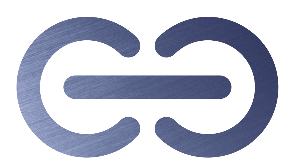
The idea for the logo came from another failed idea. I was playing around with a symbol which was based on the letter B mirrored with itself. As I doodled this I began to notice a connection with the universal power symbol (itself a graphic representation of the numbers 1 and 0).
This led me to think that the symbol itself looks a couple of links in a chain. Eventually I came up with the idea of a very short chain made up of over overlaid power symbols which would also represent the letter B.