I cut my teeth in Brand Identity with Wolff Olins in the early 90s, working on projects for BT, Allied Irish Bank and Vauxhall Motors. But it was at Pentagram that I learned the value of honing a single idea within a logo.
This approach has multiple benefits for both the client and the designer, not least being it focusses the mind on the project at hand.
BD were looking to import white label goods from the Pacific Rim, rebrand them and sell them on to UK retailers. Essentially they would sitting at the centre of both a delivery process and a network of suppliers, designers, transport companies and retail outlets.
This idea of being at the centre of an ever expanding network gave me a place to start visually.

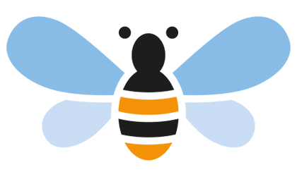
The idea of networking also gave me the idea of using one of nature's great networkers, the bee.
Sometimes, however, the idea just doesn't resonate with the client. In this instance they asked me to go back to the drawing board and I was forced to come up with a new idea.
First of all I went with two B's reflected. This kind of worked but once again the client simply did not like the image.
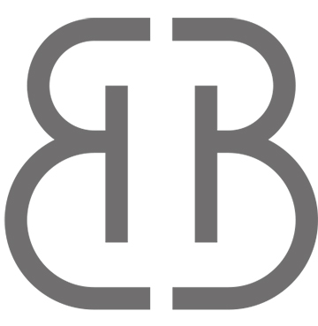
Finally I looked for inspiration in a another logo, the V&A's excellent logo which simply relies on cut off lettering and negative space.
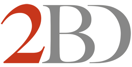
Finally I had a logo which met the brief and pleased the client. Which only goes to show, that you can rationalise your work as much as you like, but if the client doesn't react to it positively on a visceral level, then you are going straight back to the drawing board.