Creating a multichannel e-commerce tool – 01 – The plan

Every project is a journey that starts with a blank sheet of paper, and blank sheets of paper can be terrifying. There's not a lot you can do with a blank sheet of paper. It's not like you can trap it in a glass, throw it the garden and hope it doesn't find a way back into the house.

Creating an e-commerce multi-channel tool from scratch.

Often it will simply be the case that you cannot see your way from the start to the finish of the project. In that case it's best to to get started anyway. The route will work itself out.

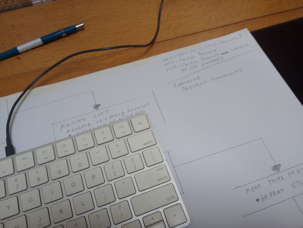
I am entering this process with a pencil and an A3 sheet of paper. I keep a small stack of A3 sheets under my keyboard for exactly this purpose. All I have to do is move my keyboard to one side and voila – instant flow chart.

I have no idea how many steps this is going to take so I label the beginning and the end as Alpha and Omega. Alpha goes in the top left hand corner and is just a wish list of things I want.

I then put exactly the same list at the bottom in the mega section. The idea being that by the time I have finished the project the wish list will have become reality.

The wishlist

  1. Brand
  2. Website
  3. E-commerce platform
  4. Inventory management
  5. Multisite sales
  6. Multisite inventory management
  7. integrated Mailing list

Reading through this list, the project now appears straightforward.

i want to create a brand which I can apply to various products and then sell those products through as many channels as possible. I want to make sure that I never oversell, irrespective of how many channels that I am using. Finally I want all of the channels to feed into a customer mailing list that I can then use that list to push repeat sales.

Once the list is finished I pencil out a sequence. I am almost painfully linear in my thinking, so for me to get anything done it has to be one thing at a time. Luckily this is exactly the kind of project that divides itself up into clearly delineated stages.

The one thing that will require parallel development is the mailing list. I think that I will have to either continually update that functionality throughout each stage of the project, or simply wait until the end and add the mailing list when everything else is in place.

Another decision that I need to make is whether I want to start flying the plane before it is completely built. In other words I could start selling once the initial website and e-commerce system has been put in place. Alternatively I could work with virtual sales until I had worked out and created the entire multi-channel system.

That's not a decision I have to make just yet so I am going to make a note of that and move on. I write any notes in top right hand corner of the sheet.

Of course there is another parallel project that I will need to do. I will need to source products that are desirable and which conform to UK product standards. I will also need to create process for refunds and returns.

You can't sell what you don't have

The biggest technical challenge will be to prevent overselling. Say I have 100 T-shirts and I sell them all on Ebay and Amazon at the same time. Every day, on average, I sell 8 T-shirts on Ebay and 4 on Amazon. Every day my local inventory reduces by 12. After 8 days I have sold 96 T-Shirts. Now I have 4 shirts left and all 4 are still listed on both Ebay and Amazon. On day 9 I sell out all 4 on both sites.

I have just sold 8 T-shirts when I only have 4 to deliver. That's a good way to get a bad reputation.

You could always just keep a close eye on your stock levels and change the stock manually. However, it would be better if the system would recognise a critical limit (lets say 80% of sales) and reduce your sales to just one single channel after that limit has been reached.

This would mean that you would never oversell because of multiple-channels.

Paper is only the beginning

Having sketched out the plan I have taken some pictures of it and will re-create it digitally before proceeding.

I know plenty of people who would use one of many flow chart tools to create this in the first place. However, I prefer to do with pencil and paper for the first draft. I just find it quicker and easier.

So having laid out a rough roadmap I will move on to the next stage: creating a brand.

Springfield Park Cafe – An ongoing project about trees

It seems that every culture loves trees. Some even worship them. Trees spring up in myths, legends and religious text with remarkable frequency. Whenever someone wants to highlight the beauty to be in found nature, the phrase "look at the trees" is often used, and there are few better places to do this in London than from the Springfield Park Cafe.

Create an A5 print booklet cataloguing the varieties of trees found in Springfield Park, East London.

It's hardly surprising. Trees are gorgeous. So when the proprietors of the Springfield Park Cafe in East London asked me to update their booklet which showcases all of the trees in the enclosing park, I was happy to take the job.

Springfield Park Cafe

Because not every job is like this. I have created print and web design for some very unappealing items. One of the first jobs I ever had back in the late eighties involved creating a catalogue for a medical facility who specialised in incontinence. Trying to find the aesthetics in that job was a real challenge.

Because this was a redesign, the elements of the previous brochure where more or less set. There would be minimal editorial input and the job would be to reinterpret the material.

Springfield Park Cafe

Unusually the first thing to do was just wait. The brief was given to me in the depths of winter and I needed a sunny day in Spring in order to wander around the park with my camera.

Once I had acquired the photography that I needed the next thing to do was come up with a concept. My main concern with the previous edition was that it had not been designed to fit the medium. The booklet is only A5 and as such the large amounts of text were rendered in a somewhat cramped fashion.

This was not a problem which would ever be completely overcome. However, by eliminating excess clutter on the pages and using the differences in type to set the boundaries between data entries, I managed to clean up the layout and giving the text on the catalogues some breathing space.

When the WiFi goes down – A question for all of your employees

In recent years I have been asked to attend a number of job interviews in my capacity as an IT specialist. In my case IT specialist means knowing slightly more about computers than the rest of the office. My favourite question is what happens when the WiFi goes down.

How good are you at working offline?

You might think that asking what happens when the WiFi goes down, is not an IT question at all.

Technically, it's not really an IT question because it doesn't address skills or knowledge. However, these day, every desk based job is now more or less a job in computing and for many people, IT and the idea of always being online are inseparable. Which is why the following question will tell you an awful lot about the person you are about to hire.

"You come into work one morning and the Internet is down. What do you do?"

Obviously there is no correct answer to this, and over the course of these interviews, I have heard a dozen different responses.

People talk about trying to fix the Internet connection themselves; they will suggest calling out their IT support; some will propose that they go to a local Café or even just using their phones.

In every case, the answer was not as interesting as the thought process that underlay it. The assumption, every time, was that the Internet was absolutely essential to their work, even in the short term.

Being online and being productive are not the same

Depending on your job, this may or may not be the case. For example, you don't need the internet to answer your emails. You can draft a response to a hundred emails and then wait for the router to kick back in.

when the WiFi goes down

You don't need the Internet to write reports. A spreadsheets can be worked on offline. Clients and suppliers are just a phone call away. You don't need the Internet to manage projects.

You definitely do not need the Internet to make some tea or tidy the storage cupboard.

In the short term, there are an enormous amount of things you can do when the WiFi goes down, but this answer never occurred to any of the interviewees.

Most of their answers were formed around the necessity of returning, as quickly as possible, to their normal working methods, and those methods were invariably tied to being online.

Of course you need to get back online as quickly as possible, so having an actual IT specialist at hand is still important. There will be tasks which can only be completed via web access. Nevertheless, the idea that being connected to the Internet is absolutely integral to your work is simply not true. But worse is that fact that it is not even considered to be a question. When the WiFi goes down your attitude towards work becomes paralysed and defeatist.

Blending your working and social life

Does this come down to simple habit. For many people the Internet means social media. By this I mean social media in it's broadest meaning. If I were to define it, I would say the most universal definition of social media could include anything which allows you to communicate. That could easily include email and even the likes of WhatsApp. Others may argue with that as a definition, but if you accept it then social media becomes the ultimate in grey areas.

If my definition holds, then many of us have fused our working life with our social lives.

This is not an attempt to demean social media in any way. Frankly it wouldn't matter if it were. Social media is part of the fabric of many people's lives and that is not going away any time soon.

You need to be in absolute control of your social media use, particularly in terms of demarcation. You must set up boundaries between your personal online use and your business use. If you don't you risk losing control of your life in ways that may not be immediately apparent.

SEO driven content – design and copy for HD Storage Solutions

Creating a website for a Transport and Warehousing company based in the Midlands characterised by SEO driven content.

Open Sans is possibly the most versatile typeface on the web

You have to admire someone who sets up a businesses during a global pandemic. This is exactly what HD Storage Solutions did in 2021, setting up a combined transport and warehousing facility near Coventry. This was one of the first projects where the need for SEO driven content was a requirement from the start.

This project began as a blank sheet. As assets go went there was a logo and that was it. No images, no copy and no real idea of how to balance the two parts of the business in marketing terms.

My biggest asset on the job was the client himself. He was open-minded and willing to listen. Moreover, he was happy for me to write the copy and to design the site with SEO as the primary driver.

Just my type

I have wanted to use Open Sans on a project for a while and this was the perfect opportunity.

Open Sans is a work of art. It can used with equal effect for headings, text, menus, buttons, and everything in-between. You can't say that about every typeface. It even works in all caps for the headlines, something that I am normally reluctant to do because it can appear to be somewhat aggressive.

Imagery came from a variety of sources. Transport by its very nature is a dynamic enterprise so the idea was to represent the idea of movement throughout.

SEO driven content

I no longer use or encourage sliders for home page content. However, I did like the idea of rotating the underlying image at the top of the home page while keeping the copy static.

In accordance with Google's preference, I have completely moved away from the idea of single page sites. That said, a home page should contain some essential information from each section of the site. This lead to creating the horizontal content bands that run down the page with SEO driven content from each section presented in each one.

Social Media Templates for Gradient Racing – layers upon layers of design

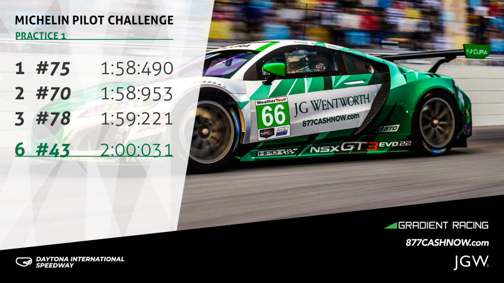
Gradient Racing are a motor sports team with an all female driver roster. They currently compete in the IMSA WeatherTech Sports Car Championship. They came to me before the start of the current season, looking for an adaptable series of social media templates.

A design style entirely inspired by the stunning car livery

The client was looking for a number of different social media templates in different sizes Portrait (1080 x 1920 pixels), Square (2025x2025 pixels), and Landscape (1920 x 1080 pixels).

Social Media Templates - 1 x 1

We used the size above to crate social media templates for Instagram, Twitter and Facebook.

In addition, we produced the templates as layered files in Photoshop which covered:

  • Quotes
  • Race schedules
  • Qualifying results
  • Race results

I was initially inspired by the creative work for the car livery. The car was covered in a chaotic fractal pattern of various shades of green and black on a white background.

Social Media Templates - 16 x 9

Inspired by the triangular shapes, I used a series of similar overlapping three sided shapes to mark out the separate areas of each template. Additionally, I used a similar diamond pattern of transparent white layers overlaid on images of the car for the text area.

In the end the multi layered look proved to be extremely effective. Moreover, it has become something of a signature look for the agency that commissioned me.

Pubs in need of a website – Part 1: The Ship in Highley

I was approached by a friend of a client who had been let down by their web designer. She had two pubs along the Severn river, both of which needed websites.

A pub in need of a website

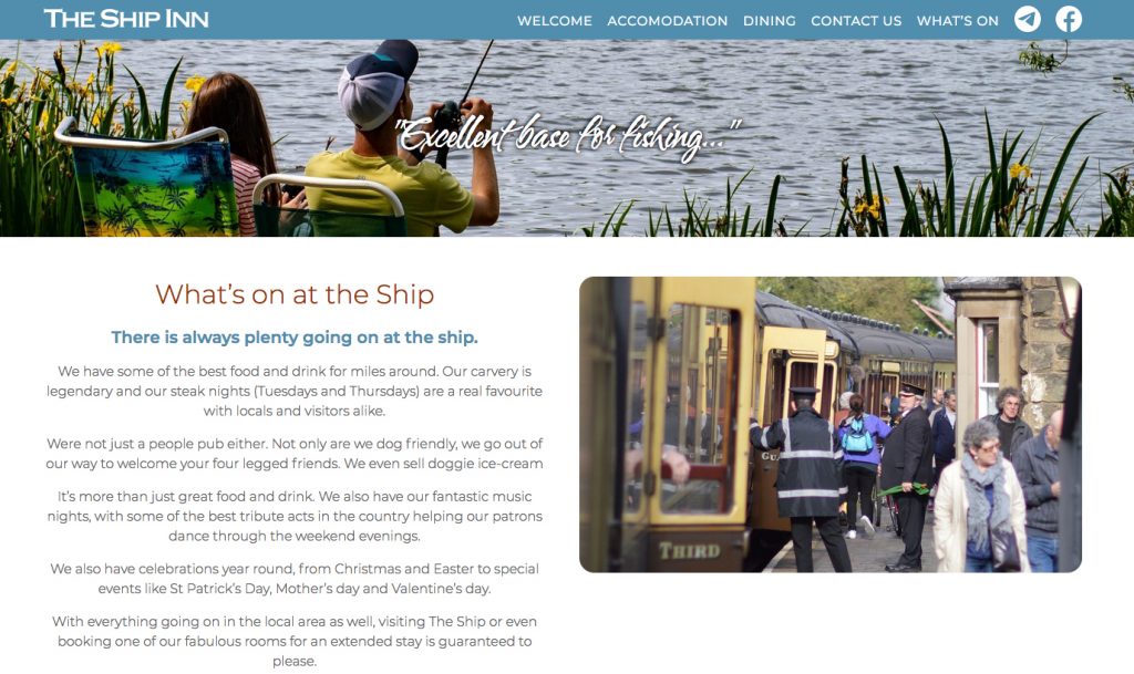
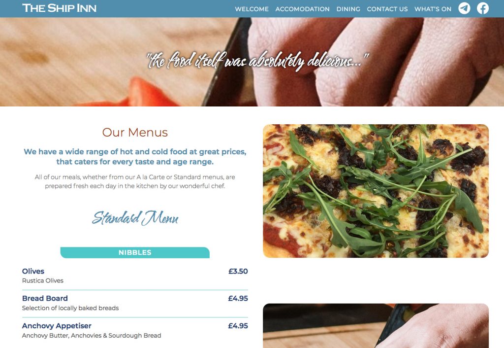
The first of these pubs in need of a website was the Ship Inn in Highley. The Ship is both a pub and a hotel with several single, double and family sized rooms. Despite being a very old pub, the ship has a modern open feel to it so I wanted the design to reflect that.

A good website will not make a bad pub better. On the other hand, a good pub should not be let down by it's website. The Ship is a modern Inn with very traditional values. Good food, good service, and a warm and friendly ambience. That's not my opinion. The Ship's customers are very clear on the matter.

pubs in need of websites

The signage for the pub used the typeface Copperplate Gothic, which I thought was an excellent point to start from, being a very distinctive font. However, Copperplate didn't really work online, with it's delicate vertical serifs. So I went looking for an established web font with a complimentary look. I choose Monserrat due to it's character with and open readable nature.

I was only going to use the typeface for headlines until I realised that it worked really well for body copy as well. The only exception to Montserrat was the quotes at the head of each page which needed a more organic look. I settled on Water Brush which balances readability with a beautifully handwritten feel.

pubs in need of websites

The Ship has an excellent reputation online, so I used various testimonials as page headers.

Once the Ship had been completed, I moved on to the second of the of the two pubs in need of a website - The Harbour Inn in Arley.

Redesigning a website – Welchome Furniture in Chelsea

Redesigning a website for a high quality Italian furniture retailer.

Minimalism is essential to highlight the quality of the products

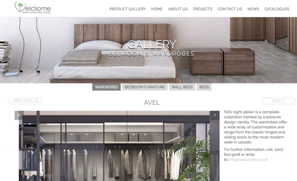
Welchome are a Chelsea based, Italian furniture outlet specialising in ultra-high quality home furnishings. They also offer a successful bespoke design service for business and residential interiors. There are many reasons for redesigning a website. In Welchome's case it was simply that the nature of websites had changed drastically since their previous design.

When I audited their website I found a number of issues. The existing site had been designed six years previously and was visually dated and cramped. The existing site was only partially responsive and the content management system was extremely limited.

The brief was to create a site that would present the visual quality of their products in a far more appealing fashion. They also required a comprehensive, yet simple Content Management System as they were continually updating their online catalogue with new products.

We highlighted the need to remove the cramped and visually chaotic elements. I stripped back the design and recreated the layouts as white backgrounds with minimal design. Myself and the client agreed that the site required a new font and installed Raleway, a light elegant geometric web font. The colour scheme was mostly comprised of neutral greys designed to place greater emphasis on the excellent product photography.

On the home page, I installed a full width carousel which uses the highest resolution images possible. The sheer quality of Welchome's product range shined through as a result.

We started with WordPress as a basic Content Management System. I added a number of additional fields and tables to allow for control of products, interior design, news and catalogues.

Whatever works is whatever works for you

Like most people in this day and age, I struggle with productivity. The world we work in seems fine tuned to provide endless distractions.

There are endless productivity tools and methods available. However, when all is said and done, whatever works is whatever works for you.

A quick breakdown of the Pomodoro technique and Post-it notes...

Getting through the working day without being sidetracked is an achievement in itself. I have tried a number of techniques to improve my productivity, often without success. In recent years I have adopted two methods which work, or more accurately, they work for me.

The Pomodoro technique is a time management system developed in the 1980s. Like all great ideas it is very simple. You simply divide your day into 25 minute sections. The full version is rather more complicated, but the important thing is that it doesn't need to be.

The full and overly complicated version.

The core process of the Pomodoro Technique consists of 6 steps:

  1. Start your task
  2. Set your timer for 25 minutes
  3. Work on your task uninterrupted for those 25 minutes
  4. When the pomodoro is complete mark out what you have done on a piece of paper
  5. take a break
  6. every 4 pomodoro take a longer break.

That's the short term behavioural pattern. In theory if you do this then over time you should able to add more to the method.

If you continually follow step 4 you will eventually get a record of how long individual tasks take. The whole idea of the 25 minute section is that you should be able to finish each one before returning phone calls, or dealing with emails, etc.. If you use your breaks to deal with these tasks then your workflow will be that much smoother.

In theory, the results of the Pomodoro sections should begin to give you an idea of how long future tasks will take. Once you are used to working with these blocks you might want to refine each period. Perhaps use the first five minutes to review the previous Pomodoro.

You can start to estimate just how many Pomodoro sessions are needed in any given day; when they should occur; and how much variation you can incorporate. Because the timetable is so well so well delineated and the individual sessions are so short, you should be able to get a better grasp of your productivity (or lack of it) each day.

So does the Pomodoro technique work?

In my case it did and it didn't.

I tried doing the pure version of Pomodoro as set out above. I found that some aspects worked for me whereas others did not. For example, I found that the 25 minute time slots were too short. When I switched to 40 minute sessions I found myself being a lot more productive.

I didn't bother marking down the results at the end of each session. Instead, I used a ten minute break to get off my desk, stretch, make a cup of coffee or just deal with my emails. Reviewing the work that I had just completed seemed pointless.

I did find that taking a longer break after 4 sessions also worked well. A half an hour in the late morning fits well with my working rhythms.

I did manage to reduce the number of interruptions by making sure that I continued to the end of each session before answering emails or making phone calls.

The system did allow me to create a more structured timetable based around the sessions. On those days that I followed the sessions I was extremely productive.

When all is said and done, parts of the technique have proved useful to me and I will continue to use it. However, I would not have been able to maintain it if I had to follow every step religiously. Whatever works is retained and the rest has been thrown away.

Planning with Post-it notes

The Pomodoro technique is all about getting through the day with a minimum of interruptions and maxing out your productivity. The Post-it note method is more about how to plan your day in the first place.

The other Post-it note method

When you mention the Post-it note method, people assume you mean brainstorming. They picture a wall covered with Post-it notes all containing a single idea which then are grouped together in an an attempt to find some kind of coherent work flow.

Whatever works

The other Post-it method

Write a to do list. However, don't write it on a piece of paper. Write it on a Post-it note. I know that it sounds ridiculous. A Post-it note is tiny. You can hardly fit anything on it, which is the point.

It will be a short to do list. More importantly it will be a manageable list. If there are too many items to fit on the note there is always tomorrow.

This method gives you a list which you should definitely be able to complete in a day. You avoid wasting time writing out a long list of tasks that sit there for days, leaving you demoralised and demotivated.

If you complete everything on the list then you stop. That's it. Your day is done. Go and enjoy yourself.

This may seem like a bizarre approach but it works. I don't often finish my Post-it notes early. Some times I don't finish my Post-it note at all and some of the things have to be held over until the following day.

However, what does happen is that I approach each day with a seemingly manageable set of task which I am always confident about getting through.

So those are my productivity techniques and they work for me. Maybe they would work for you too, but if they don't it doesn't matter, you just need to find whatever works for you.

INHOUS Letting – an example of third stage corporate design

What is third stage corporate design? In corporate design stage one normally refers to establishing the brand elements such as logo, colours, and typefaces.

Sometimes working within restrictions brings out the best in your creative instincts

Stage two usually involves the creating the client's primary visual assets, business cards, documentation, letterhead, website, email signatures, etc.. The designer leverages the brand assets in a visually creative way but also maintains the integrity of those elements.

third stage corporate design

The third stage comes once all of those assets have already been established.

One one hand, this is less of a freely expressive exercise than stage 1 and 2. On the other hand it requires a different kind of creativity. You still have to come up with solutions that are visually arresting, communicate well, and remain faithful to the brand guidelines.

third stage corporate design

Inhous are a specialist property brokers operating in the UK and Ireland. They deal with highly valuable properties requiring specialised skills and knowledge alongside a great deal of discretion.

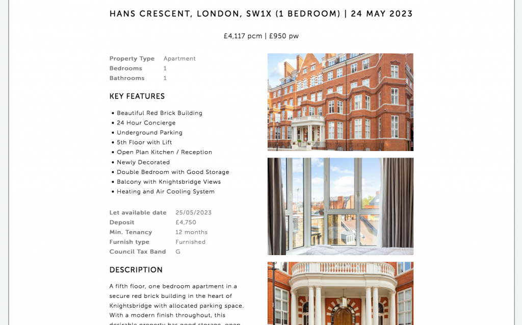
INHOUS decided to move into lettings alongside their existing sales service. As a result, they asked me to create layouts for letting out multiple properties.

There wouldn't be a lot of content given the expensive nature of the properties that they were offering.

I respected the established corporate identity (as every good designer should do) by keppeing to the existing website layout, colours and typography. Within those guidelines, I created an alternating layout that presented the properties in the best light. I was careful to remain consistent with the rest of the site while creating the new layouts.

Content updates – Rebel Rock Racing

Content updates are like a middle child, much loved but sometimes neglected. Content management systems are supposed to put content updates and creation in your client's hand. But simply having the tools is not enough if you don't the time or the basic skills required.

Why even the smallest of jobs can be disproportionately important to both you and your clients

This is a point that is universally true. Having a scalpel won't make me a surgeon, and owning a saw won't make me a cabinet maker. Just giving a client the keys to WordPress will really help them with content updates. They will also need a lot of skills that I take for granted.

  • Copy-writing
  • Asset acquisition
  • Editing
  • Layout
  • Photo editing
  • Knowledge of wordpress
  • A basic IT skill-set

And most importantly, the one thing that requires a bullet list all to itself.

  • Time

Many of my clients don't have the time or even the inclination to learn this, so they end up by asking me to do it and I am always happy to oblige.

content updates

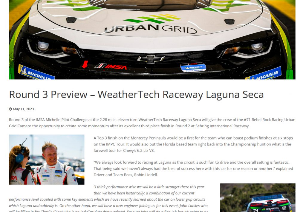
The Rebel Rock Racing website needs regular but infrequent updates. It involves putting in a news story, a little bit of formatting, and finally adding the story to the homepage carousel.

It's a 10 minute job for me but a much longer task for my client.

The point of all this is that there is value in knowledge. It speeds up processes and enables you to present a guarantee to clients. Every story I put online quickly and accurately just adds incrementally to the most important aspect any client agency relationship, which is trust.

Learning to embrace failure in sport, in order to avoid helplessness

learning to embrace failure to embrace failure is particularly hard in table tennis. For a sport involving two bats and a tiny plastic ball, table tennis can be ferociously intense. Body language is far more telling in this game that it would be in many others. Outside of actual combat sports it's hard to think of a game which forces competitors into such close proximity.

Helplessness is learned behaviour. Failure can break you out of that habit.

These days, whenever I face a player who regularly beats me, I try to push negative thoughts to one side and concentrate on winning the game at hand. When, on the other hand, I play someone whom I regularly beat, sometimes they give me the impression of thinking, ‘here we go again’, resigned to the fact that they are not going to win. Naturally, this mentality virtually guarantees that they will lose and rather than learning to embrace failure they are simply resigned to it..

Charisse Nixon is an Associate Professor of Psychology at Penn State University. She describes this state of mind as ‘learned helplessness’, a situation where an individual convinces themselves that they cannot change the outcome. She likes to take her students through an experiment to show how quickly this attitude can take hold.

Fake word problems

Two groups of students are given anagrams to unscramble, starting with simple ones and moving on to progressively harder ones. The groups are told they have all been given the same words. However, whereas half the students get the progressively harder words as promised, the other half get impossible words from the outset.

As the test progresses the students from the difficult half see the other students raise their hands each time they solve a puzzle. In the meantime they themselves cannot find the answers. Not knowing that the test is rigged they begin to assume that they are just no good at this type of problem solving.

During the final round all of the students are given the same word. What almost always happens is that the first group, who had to work with progressively harder words, succeed again. The second group, who were set up to fail from the beginning, fail again. This is despite the fact that the anagram is the same one for both groups.

One group has been taught that they can succeed. The second group have been misled into believing that they will fail and so they do. This is ‘learned helplessness’. Nixon explains how it can apply socially as well as academically. I think it also applies to sport. It’s something that sooner or later, every player will have to face.

A lesson from another sport

Ever tried. Ever failed. No matter. Try Again. Fail again. Fail better.

This quote from the Irish playwright, Samuel Beckett, is tattooed onto the forearm of the tennis player below, Stanislas Wawrinka.

learning to embrace failure

Wawrinka is a Swiss professional, the winner of three grand slams.

So what can a tennis player teach us about rejecting helplessness through embracing failure? It is all to do with the quote. Wawrinka won all three of his major titles after the age of 29. That’s the age when, traditionally, even the best players start to decline. Many players such as Nastase, Borg, Sampras, McEnroe, and Lendl had finished winning titles by then. But Wawrinka was just getting started.

Given his huge talent, his entire career had been something of a failure up until that point, but no matter. He would try and fail, and the next time he would fail better. As long as he kept getting better each time, failure was not an issue. He kept picking himself up, practicing harder, improving his game, working all the time, and eventually failure turned into success.

The lesson is straightforward. Eliminate helplessness by embracing your failures. Learn what lessons you can from each failure and try again. It doesn’t matter what has gone before. It doesn’t matter how good or bad we are today. Tomorrow we can all try again and tomorrow we can all fail better.

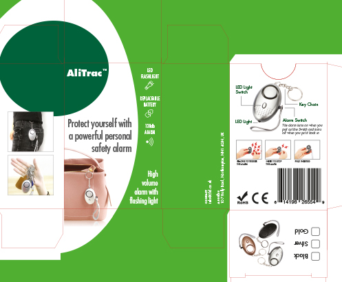
Alitrac – Packaging

Creating a design from a packing template for a personal alarm.

Packaging is unlike every other type of graphic design in its sheer complexity.

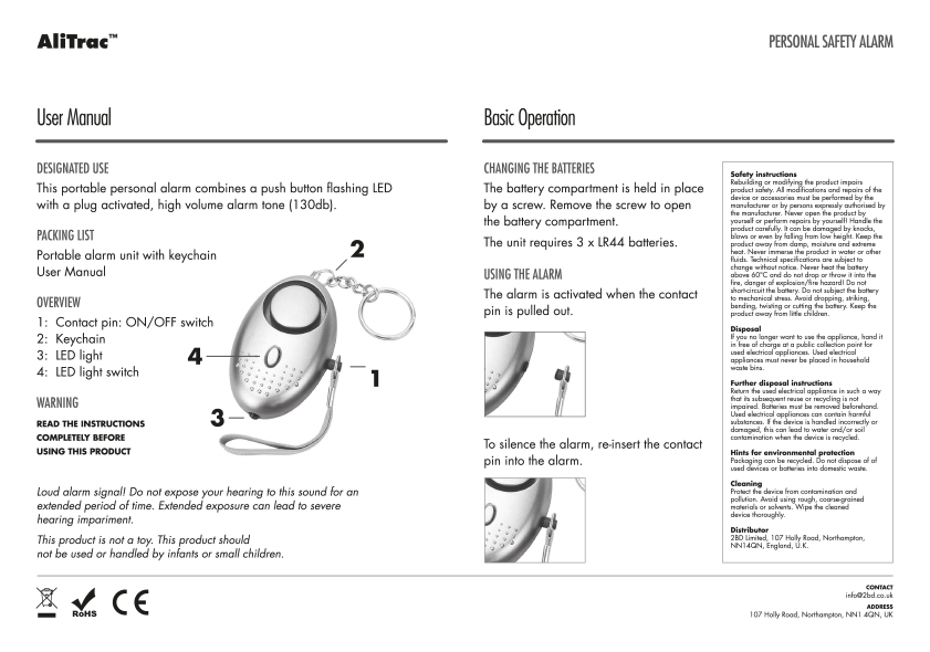
Alitrac is a branding vehicle for BD Networking. Their first product was a rebranded personal alarm, combining an ultra high sound emitter with a flashing LED. The device would be perfect for vulnerable people travelling in potential hazardous areas or situations. Creating a design from a packing template was the main part of the brief but before I could do that I needed a logo.

Creating a design from a packing template

Packaging comes with a unique set of challenges. Packaging projects are visually dense, with a huge number of elements needing to be incorporated into a relatively small space. This makes the potential for getting the visuals and the messages lost in the sheer overload of information compressed in such a small space,

Balancing these elements while maintaining visual impact is the needle that you have to thread.

Creating a design from a packing template

I created the packaging using colours that were sympathetic with those of the main retailer, Lloyds Pharmacy. I received some assets from the product supplier, such as the product images and a few sales shots. They also helpfully supplied an accurate die-line for the artwork

In the end I used a graphic silhouette of the egg shaped product as a starting point.

Building a website and a brand at the same time – Mobile Wheel Clinic

Mobile Wheel Clinic is a collaboration between one of my existing clients and a diamond wheel cutting specialist in the midlands. Building a website and a brand at the same time is not ideal but it can be done.

When what you want is a website but what you really need is a logo

They came to me asking for a website. However, they also needed a corporate Identity. They didn't even have a logo at that point. So the situation required building a website and a brand at the same time.

One lesson that has stayed me for years is that a good design embodies one idea and one idea only. After a couple of false starts I realised to me that the logo should be sharp and aggressive. The company's main service is repairing wheels using a diamond sharp cutting blade mounted on a lathe and the logo had to reflect that.

So the logo became a visual expression of sharpness, and needed to be forcefully presented.

Building a website and a brand

So I went with Jost, a typeface based on Futura. It's a geometric sans serif with very sharp lines and angles. This was perfect for the Logotype. The next idea was to take the company's initials and cut sections of the lettering off. Given that cutting was the core of the company's offer, this seemed appropriate.

Building a website and a brand

Finally I continued with the aggressive approach and went with black and red for the corporate colours. The client was very happy with this as they had found the alternatives to be somewhat insipid.

Building a website and a brand

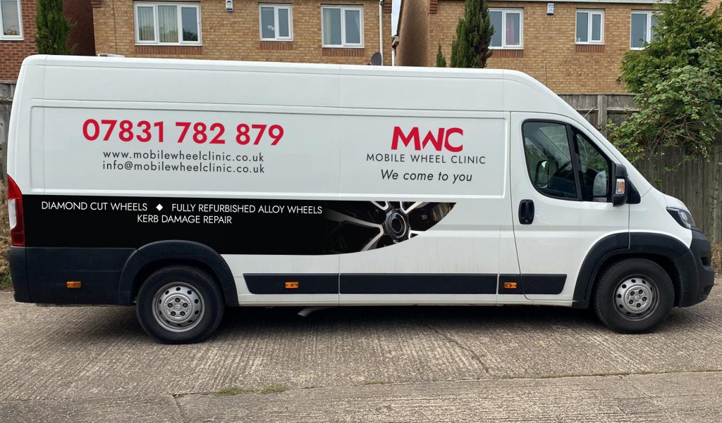
Once the Logo had been approved, I was asked to help with the livery for the company's main vehicle. This van would be their base of operations and as such, would be useful for advertising and brand building.

I took the idea of sharp edges and created a design underpinned by a blade running the length of the van. The most difficult thing was making sure that every aspect of the design would fit in with the various parts of the vehicle. Eventually we balanced all of the elements and the livery was complete.

Building a website and a brand

This was the first opportunity to employ the logo out in the wild, as it were. I was very happy with the results.

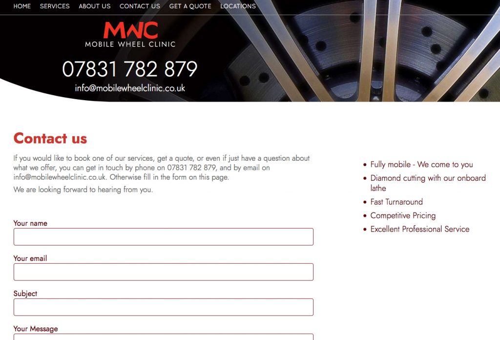
Once I had delivered the van artwork, I returned to working on the Website. The curved blade graphic that I had used for the van turned to be an ideal fit for the website as well.

Building a website and a brand

This allowed me to use a lot of diamond cut wheel imagery as background images. The images give each page its own character.

As has become increasingly common, I ended up writing all of the copy for the site as well as designing and coding it.

2BD Corporate ID – The usefulness of a business card

Corporate identity, like so many things, has become increasingly focussed on the digital aspects of branding. That said, for small business and especially start-ups there is still a lot to be said for the usefulness of a business card.

Abstracting typography until it becomes graphic rather than text

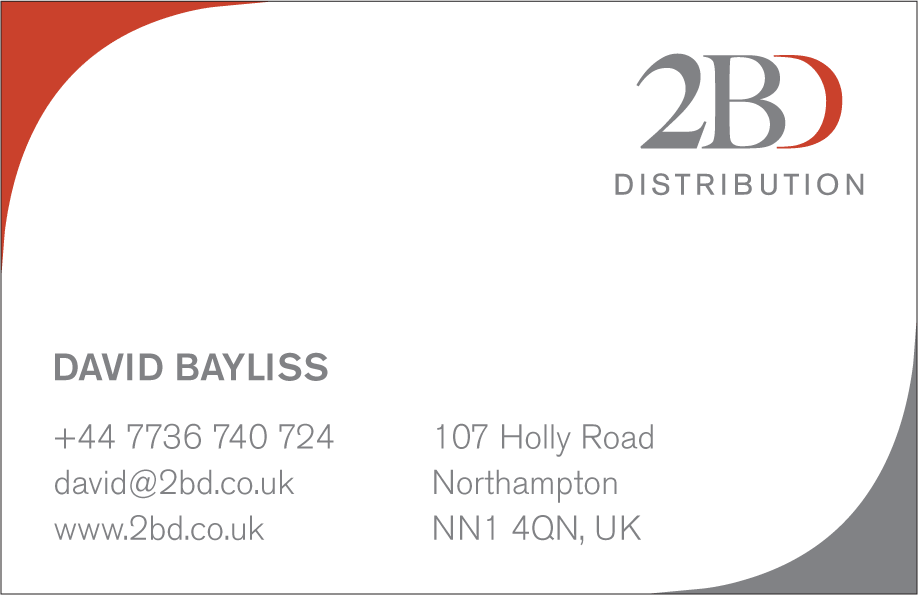
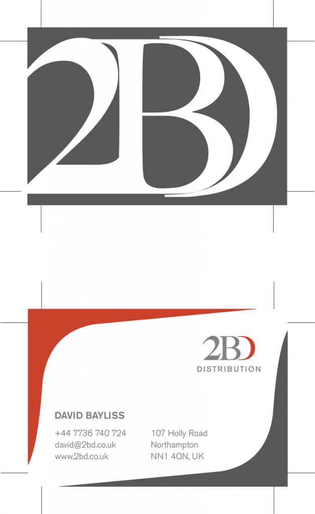
The usefulness of a business card is beyond doubt. A good business card works hard for you and your enterprise. It creates an impression and imparts a lot of useful information all condensed into 85 x 55 mm. For 2BD, I wanted to work with a purely typographic image that would be immediately recognisable while saving the rear of the card for all of the necessary corporate details.

My preferred solution was to do something that you rarely see on a business card, a photograph. Failing that I wanted to reduce the typographical elements until they became a purely graphic entity.

The client drew the line at the idea of a photo on the back of the business card so text as graphic it was.

I ended up overlaying the characters on top of each other and then enlarging them. This meant that they were severely cropped at the edge of the card.

The graphic flourish on the information of the card came about as a happy accident. I initially wanted to have those bleeding off the corners of the card. However the client didn't really like the visual. When I was tried to delete them from the artwork I ended up reducing them by accident.

This resulted in the basis of the final image with the two corners framing the text.

Victorian Pleasure Gardens History Boards

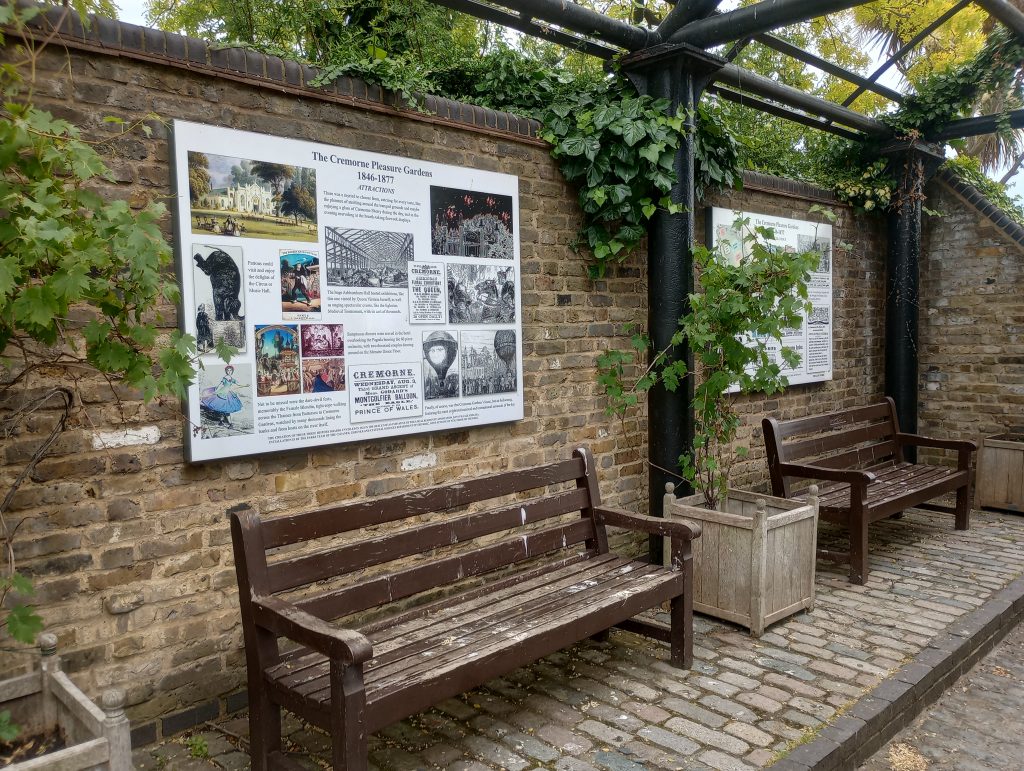
Cremorne Gardens was among the largest and most notorious of the many pleasure palaces that dotted London throughout the mid to late Victorian era. The Victorian Pleasure Gardens History Boards at Cremorne are a testament to the original park's history.

A series of boards commemorating the extraordinary history of the Cremorne Pleasure Gardens

For more than three decades after it's opening in 1845, the park provided an extraordinary array of entertainments and events to the newly wealthy middle classes. They created an range of entertainments going from coffee by the river to a full-scale recreation of the battle of Sebastapol. The gardens eventually closed in 1877, due to local opposition to some the more disreputable aspects on display. Dubious pleasures such as bare knuckle boxing, gambling and prostitution. The idea of creating pleasure gardens history boards was the brainchild of a local resident.

Design

A local historian approached me with an idea to create three boards commemorating the history of the gardens. She planned to locate the boards in a gallery in the modern day Cremorne Gardens, a small public park on the banks of the Thames. This park is the last remaining tiny vestige of the original pleasure palace gardens.

She had already completed the designs but they were nowhere near the standard required for artwork. What she had produced were low resolution scamps created in Photoshop which worked as a starting point.

Artwork

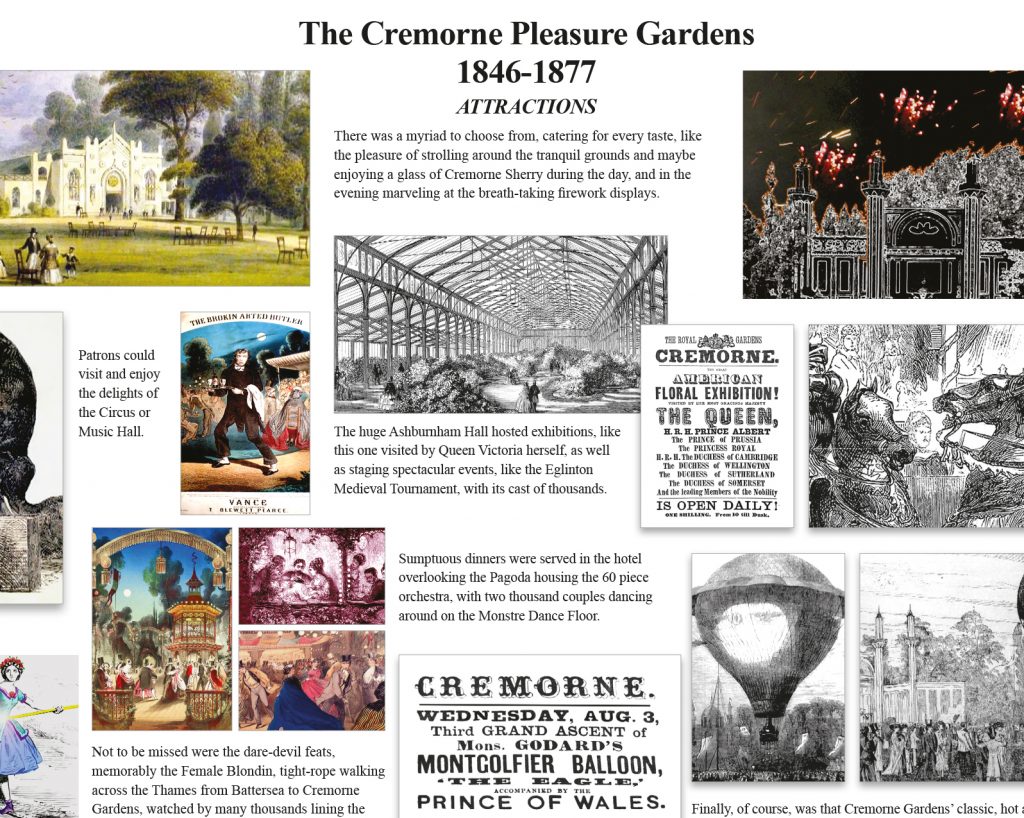
I re-created the boards from scratch, using a 12 column grid to align the somewhat chaotic elements. Grids provide a versatile structure for any changes and additions. My client was working with a number of local museums and other historians. Given the collaborative nature of the project, there were ongoing changes throughout the process.

Creating large boards on a small computer monitor means that you have no idea if they will work. Not once mounted on a wall in real size (the final artwork was 2A0).

Once the initial draft had been completed, myself and the designer went to the gardens. We were armed with a printout of one of the boards, tiled into A4 sheets. Then we spent an hour or so creating a full sized mock-up, taping the sheets onto the wall one by one.

This proved that the boards worked at full size in terms of layout and legibility.

Production

By the end we made a number of revisions and sent various versions to the banner company who would produce the final artwork. As a precaution I asked the banner company to sent me a photo of the final artwork as it came off the press. Normally I would prefer to be present as the artwork is created but that is often just not possible.

As is so often the case, the printers used one of the previous (outdated) versions of the artwork by mistake. However, this showed up on the photo and we notified the company to rectify this.

A psychologist, the tube map and the trouble with narrow definitions

Jordan Peterson is a well known clinical psychologist and self-help author. One of his favourite topics involves the nature of creativity as an aspect of one's personality type. His ideas are well thought out, even though framed within his own North American cultural biases. As a result of these biases, he sees creative people as liberal and non-creativity as a conservative trait. Moreover, he proposes that pursuing your creativity is a very high-risk strategy in life, which he sees as the hallmark of a more liberal mindset. This brings us to the the trouble with narrow definitions.

Creativity is far more prevalent in our lives than most of us think

The problem with this analysis is not that his conclusions are wrong, but that he seems to be basing them on a very narrow view of creativity. From the way he describes it, Peterson obviously thinks that creativity is uniquely found in artistic expression, and the the trouble with narrow definitions is that they lead to narrow conclusions.

For him, an architect would be creative whereas an engineer would not. A fine artist would be creative but not a draughtsman. He regards it as axiomatic that going to work every day is impossible for anyone of a creative bent. This is not my experience after thirty years of working in the creative industries.

In the early 90s I had the luck to work in the same office as the extraordinary graphic designer, Alan Fletcher. Fletcher understood creativity to be the ability to recognise connections that others simply do not see. However, he also recognised that making those links was a lot more commonplace than people realise. He once said to me that "everyone is a designer" and he was right.

Everyone includes you. Your home, your workspace, your clothes and your entire lifestyle require some degree of creative input. Irrespective of whether or not you flouting conventions, adhere to norms or subvert expectations, you are either choose means of self-expression or simply solve pragmatic issues in creative ways.

Peterson's idea of artistic creativity can also be misleading. An example would be an amateur painter, who is skilled with a brush. They spend their days faithfully reproducing landscapes. Despite appearances, there would be nothing remotely creative about such a person. Artistic yes, in a reductionist sense, but not creative.

So how does this link to the London Underground?

The Tube map – the map of the London Underground – is a creative solution that lies entirely outside of self-expression. Despite the fact that it displays a phenomenal grasp of visual acuity and technical skill, it is representational only as means of wayfinding. If you placed the tube map alongside a picture of hay wains rendered in oil on canvas, we know which one Jordan Peterson would pick as an example of creativity.

However, the Tube map perfectly represents the broader idea of creativity because it involves connections that are not immediately apparent. The map grew out of a need to render a complex system in simple, navigable terms. This is never an easy task and it would have proved to be impossible if not for a purely creative leap.

To understand this we have to examine the London Underground itself. Five separate companies built and operated the first tube lines. As a result, they did not get together to creates a composite map until the early years of the 20th century.

The map above was commissioned in 1907 by the five companies who were operating the various lines at that point. It should be noted that even though this early version of the Underground was only a fraction of the complex system that it would become, it was still an incredibly difficult task to represent it realistically against a physical map of London. It's a beautiful piece of work, both in design and execution, but it highlights the problems of rendering a complex system visually.

The real Tube map

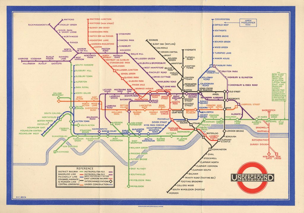
In the late 1920s Harry Beck, a draughtsman working for the London Underground, made the conceptual leap away from a geographical map to a topographical one.

Whereas geography concerns itself with physical spaces as a whole, topography is more concerned with the individual features of such a space. Beck understood that passengers were not interested in the actual physical distance between stations, only how many stops they would travel and where they should change trains.

His real leap was when he adapted a completely different discipline to meet his needs. He began to lay out the underground system as though it were an electrical diagram. He represented each station as part of a system while ignoring its actual geographic position. Then he incorporated the existing colour coding of lines in order to allow passengers to plan their journeys more effectively. Finally he used his draughtsman skills to realise his ideas.

The Tube map seems obvious to us now. However, when Beck took the idea to his managers they rejected it on the basis that is was too radical. Despite this early setback, once tube travellers got their hands on some test prints there was no going back. Public approval of the map was universal.

From 1933, London Underground mass produced the Tube map for the London public and has done ever since. The map's designers have accommodated all of the extensions and additions to the Tube in the nine decades since it was first introduced. Another testament to it's effectiveness is that virtually every municipal railway project across the globe has adopted the tube map as a template for their own maps.

Why is this important

Creativity is a huge factor in human development. It manifests in writers expressing their innermost landscapes, in teachers communicating with students, with engineers developing systems to bring architects' visions to life, and even for medical professionals searching for solutions within a pandemic.

These are just a few scattered examples of how creativity is intrinsic to progress.

In the end, the trouble with narrow definitions is that we cannot afford to narrow creativity down to artistic self-expression. It won't do us any favours as and when we face the challenges to come.

A tale of two pubs in need of a website – Part 2: The Harbour Inn Arley

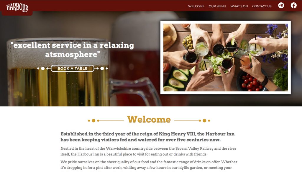
The second of the two pubs in need of a website was the Harbour in Arley.

The harbour has an old-fashioned appeal and I wanted to reflect that in the design

This beautiful pub is situated up the river from the Ship and was a slightly more straightforward job as it is not an inn (despite the name). As the second of the two pubs in need of a website I decided to do this immediately after the ship as it was slightly more straghtforward.

pubs in need of a website

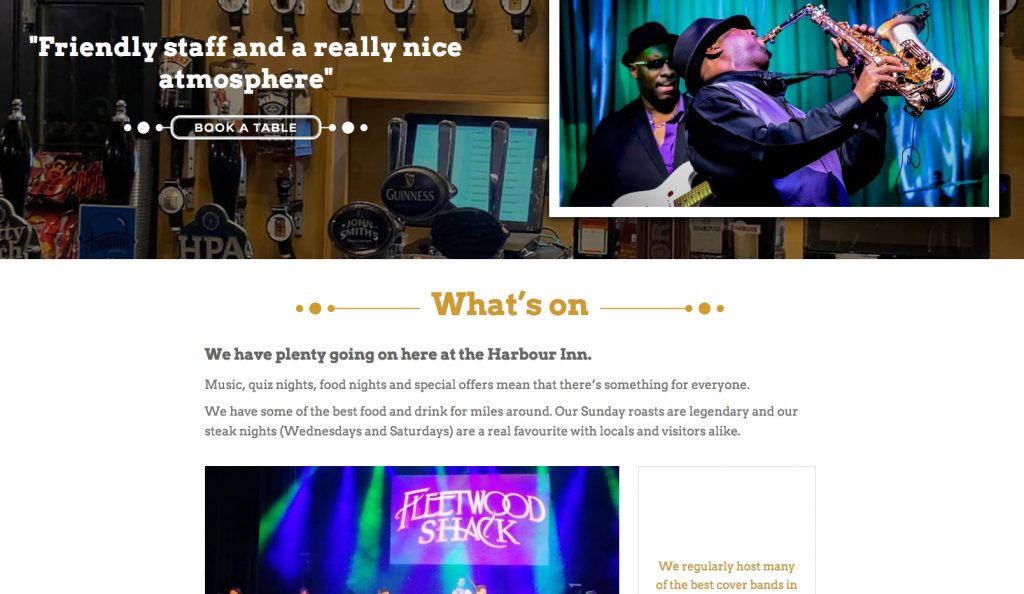
I decided to go for a more layered, old-fashioned look for the site, with rich graphic elements underpinning the backgrounds on the home page.

pubs in need of a website

As with the Ship I was able to leverage the good will of their clientele by using quotes in the page headers.

Thaze Racing – Social Media templates and a break from habit

Thaze Competition are a Motor Sports team operating out of Detroit - who in their own words - are taking a fresh and irreverent approach to high octane racing.

A suite of social media templates for an American motorsport team

They are currently running their gorgeous olive and gold Mercedes AMG in the IMSA Michelin Pilot Challenge series. For Thaze Racing Social Media templates were just another piece of their marketing puzzle, albeit a significant one.

Thaze are the third motor sports company I have worked with in the last 12 months. All three commissions came via 9 Sixty Two Media, a marketing company operating in The USA and Europe.

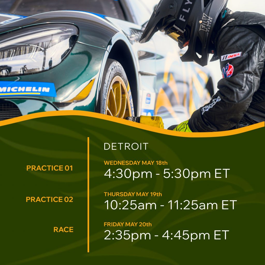
The client required a number of different social media templates in different sizes Portrait (1080 x 1920 pixels), Square (2025x2025 pixels), and Landscape (1920 x 1080 pixels).

Thaze Racing - Social Media templates

The sizes above would cover social media assets for Instagram, Twitter and Facebook.

The templates would be produced as layered files in Photoshop and cover:

  • Quotes
  • Race schedules
  • Qualifying results
  • Race results

Although the scope of the document was the same as the previous two jobs, the design approach was somewhat different.

Thaze Racing - Social Media templates

The creative brief for all Thaze Racing Social Media templates included the usual caveats about keeping to the Corporate branding and creating assets that would be distinctive looking, sympathetic to the brand, appropriate to the audience, and of course, legible.

However, the agency wanted to move away from their signature design style, which they felt had been overused in recent projects. The agency favours a chaotic, multi-layered design style, with a emphasis on shadows, patterns, layers and transparent overlays.

Thaze Racing - Social Media templates

The obvious solution was to use a flattened design, inspired by the car livery itself. My idea was to split the assets into two simple and discreet areas for images and text. The border between these lines was a thick curving line to represent a race track.

The only nod to the agency's previous design work and trademark style was a faded watermark of the Thaze logo lying behind the text.

Pride versus passion, and why project managers need both

If there were a candidate for the most overused word in business then "passion" has got be right up there. This word used to come up a lot in the creative industries. Now it seems to spring up everywhere. The question that we should be asking is about the usefulness of pride versus passion?

Getting the job done takes a lot more than just passion

It seems to have become a particular staple of job listings. Do you have a passion for reaching out to disaffected youth? Or do you have a passion for creating complex delivery systems? Maybe you have a passion for vertically integrated markets? There are even those who have a passion for scaling client-supplier inverted promotional strategies?

Actually I made that last one up, but the rest are real life examples. It seems that every organisation is full of passionate people, passionately delivering their passion projects in passionate way. This is not lazy copywriting, it's lazy thinking. Even if you are passionate about what you do, you are definitely not passionate about every part of what you do.

A passion for music?

I used to play bass guitar in a semi-professional covers band. What could be more passion driven than a love of music and the chance to play it live. Surely I had to be passionate about that?

Don't get me wrong. Playing live was wonderful. However, an inevitable part of doing each gig involved loading and unloading a quarter of a ton of PA equipment into a van each evening. Twice.

Pride versus passion

Pride versus passion doesn't even enter into it. Was I passionate about that part? Of course I wasn't. Arnold Schwarzenegger might be passionate about lifting heavy weights but it's pure drudgery as far as I am concerned. That was the tedious part of the job, but it needed to be done and it needed to be done properly. If you are the kind of person who only does the parts that you really care about, then everything you do is going to end up half-baked.

As a word, passion has been rendered meaningless by overuse. It goes into job descriptions, PR releases, status reports, pitches, proposals and everything in between. It gets inserted without consideration and as such, should be dismissed without consideration. Whenever someone tells me how passionate they are about their work, my eyes tend to glaze over.

The original meaning of the word meant either physical lust or uncontrolled anger. Neither of these are particularly useful in the workplace.

Granted, passion is great for getting projects started. But it doesn't last, and once your passion is burnt out you usually find that 90% of the project still remains. So how are you going to deal with that.

Take pride

Pride versus passion is an odd question. Its a strange thing that pride has been generally regarded as a negative trait throughout history. Most religions regard pride as being the first and most serious of the deadly sins. Despite this, a lot of the language that surrounds the word is often quite positive.

  • Pride of place
  • Pride of Great Britain
  • Take pride in your work
  • Take pride in your appearance
  • Bursting with pride
  • I am proud of you...

Pride can be one the most positive drivers of human behaviour, and taking pride in your work is one the best attributes you can bring to the table. Taking pride in your work means dotting the I's and crossing the T's, It means measuring twice and cutting once. it means double checking your work and applying the fishing touches. Most of all it means recognising that God is in the details.

Talent is for amateurs

A professional musician once told me that "talent is for amateurs, the rest of us have to show up." What he meant was that talent was all very well, and you could not be a professional musician without at least some minimum of ability, but it would not be enough on it's own.

Professional musicians cannot afford to be just talented. They have to show up, on time, every time, ready to play. This can be a problem with talent, that it can often be used as an excuse for unprofessional behaviour.

This in turn brings us back to passion. Passion won't allow you to slog through endless spreadsheets looking for an error. Nor will passion help you debug a complex array of functions in a database. I am pretty sure that passion won't help you proof-read a 200 page contract.

Pride in your work will help you do all of those things. More importantly it will help you do them well. Not only will pride get you to the end of a project, it will also help you execute every single step correctly along the way; ensure that you avoid taking shortcuts; and help to make sure that every last aspect of the job has been realised as well as possible. When weighing up the usefulness of pride versus passion we would do well to remember that it's far harder to finish a project than it is to start one.

So if you do not already, learn to take pride in your work. You are going to need it.

Good signage and your grandmother

I was once told that you should design good signage with your grandmother in mind. The idea was that if you were to drop your granny off in the middle of a building complex, she should be able to get anywhere she wants to go without asking for directions.

Where signage is concerned, beauty and clarity go hand in hand

Now that may sound patronising to grandmothers. However, in this instance she merely represents the everyman (or woman). Good signage should require no special or esoteric knowledge. You should be able to quickly navigate from any given point to any other point within the system at all times.

The art of wayfinding

Signage is just a method of aiding wayfinding, the process by which human beings orient themselves within - and navigate through - their environment.

We have evolved to be really good at this, so we tend not to think about it too much. The only time it enters our mind is when we get lost, or when we enter a novel, complex environment. This where signage becomes helpful, and in some cases crucial.

There are subtleties to signage that most of us never have to consider. Take motorway signs. They have the specific problem that they have to be read at 70 miles an hour. One of the cleverest ideas that British road sign designers made was to use lowercase letters for place names. This is because when we see a sign saying Bristol, we recognise the shapes of the letters rather than actually read the text. The brain then does the rest. This is much harder to do with capital letters because they form a visual rectangle as in BRISTOL.

Another part of the designer's art is to know when should use symbols rather than words. Some signs are better represented using images because of language barriers - toilets and rest rooms being the perfect example.

Beautiful versus functional

Signage is one of my favourite design disciplines because there is no real trade off between function and aesthetics. Your sign and directions can be useful and beautiful at the same time. The science museum with it primary colours, custom typeface, and integrated design is a great example of this.

But it's the efficiency of signage which makes the difference between success and failure. Nowhere is this more evident than hospitals.

Hospitals are different to most complexes. In a shopping mall or museum, bad signage might cause confusion and delay. In a hospital bad signage might potentially cost lives. The task is usually complicated by the fact that many hospitals were not designed with this in mind. They are often an amalgamation of buildings that grew around the original hospital. They might have been formerly used for other things and then repurposed as hospitals. Only the most modern hospital buildings are designed with the flow of people incorporated into their actual design.

The word "hospital" comes from the Latin hospes, meaning stranger or guest. The word hospitality comes from the same root. My last visit to a hospital involved visiting six different parts of the building and lasted nearly 24 hours. I didn't get lost once and I don't think I am particularly good at navigating spaces.

In the end it all comes down to balance.

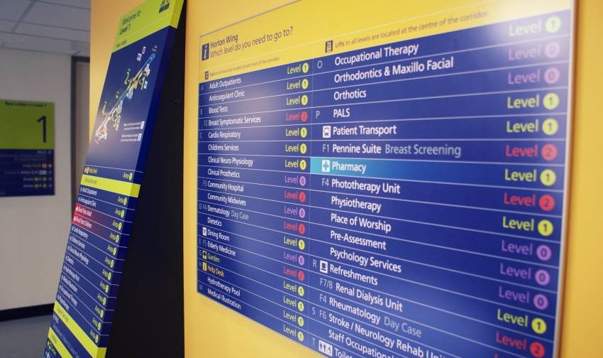
The NHS designed their signage with all the right techniques. Colour coding; lowercase lettering; widely spaced lettering (easier to read at a distance); words reversed out of colour panels; desaturated background colours; judicious use of symbols and an excellent use of directional arrows.

The trick is to balance out all of these various elements to produce a coherent message to the patient.

So the next time you are wandering the halls of your local hospital, shopping centre or museum, give a thought to the unsung heroes who are guiding you on your way.

Football, water carriers and why you should never, ever employ a Rock Star

Some football fixtures are just special. In September 1996 Manchester United went up against Juventus in the group stages of the Champions League, the kind of fixture that even neutral fans would mark in their calendar. It also saw United's superstar Eric Cantona going up against his countryman Didier Deschamps. The battles on the pitch went the way of the Italians with Juventus winning home and away, but in the war of words between the French players, there was only ever going to be one winner.

Cantona disdainfully flicked away his rival by damning him with the faintest of praise. "He gets by because he gives 100%, but he will never be more than a water carrier".

Dechamps had no choice but to agree. “A water carrier? Yes, that’s exactly what I am. Great teams are not just created by the architect but also by bricklayers and hod carriers.”

Cantona, of course, would end up being so much more than your average footballer. He was half renaissance man and half savage. He was equally fond of philosophy, art, and kicking mouthy Crystal Palace supporters. Deschamps went on being a water carrier - tackling and passing his way to a bucketload of titles, and eventually leading his country to win the World and European Cups. It should come as no surprise that of the two, he was by far the more successful footballer.

Talent with the wrong attitude can be a real problem for management

Cantona was a player whose talent and ego, combined with the indulgence of others, produced something that was part angel and part demon. He was probably the first real rock star that the Premiership and satellite TV ever produced. Like many before him, he fundamentally misunderstood the importance of his role. This is not to say that he wasn't a genius. Earlier that year he and Peter Schmeichel had combined their talents to achieve five 1-0 premiership victories in two months, which ultimately led to United overhauling Newcastle on the way to winning the title.

Being what he was, he inevitably misunderstood both the difficulty and the importance of being a so-called water carrier.

Deschamps is hardly unique in being dismissed in this fashion. Claude Makélélé was a pivotal part of Real Madrid's success in the three years he spent at the Bernabéu. But when he requested that he be paid a similar amount to Real's galacticos - Zidane, Figo, Raúl, and Ronaldo - the management derided both his importance and his abilities and shipped him off to Chelsea. What followed was instructive to say the least. Makélélé became a pivotal part of the West London club's rise to the top of the European game. For their part, Madrid spent millions trying to replace him. It didn't go well.

Rock star developers

In the software industry everyone always seems to be looking for rock stars. You see it in far too many job advertisements. It often gets lost in the array of idiotic adjectives that seem to attach themselves to tech job descriptions: gurus, ninjas, evangelists, etc...

The rock star is the worst of them. They myth goes that the rock star is talented to a supernatural degree. He or she will produce more and better code than a dozen mere mortals. Ordinary developers create complex solutions to simple problems; great developers create simple solutions to complex problems. Rock star coders supposedly go beyond that and just make your problems disappear. It's a myth, and a problematic one.

Obviously we are not talking about real rock stars. These rock stars don't sell records or play stadiums. They don't trash hotel rooms, or drive their gold-plated Rolls Royces into Les Paul shaped swimming pools. But they have the attitude, the ego, and the monstrous self-entitlement, and that is the problem.

Rock stars don't make your team better. On the contrary, they will inevitably make your team worse. This is because they don't understand the value of water carriers.

The problem with clichés

The real problem with clichés is that they are true, so true that they become dull and trivial, and it's a cliché that it takes a team to win. Rock stars often don't get that. In their world the rest of team are either there to make them look good, or else they are just along for the ride. I should know, because I used to be one.

I entered the graphic design industry in 1987, a time when Apple Macintoshes were wreaking havoc on the industry while transforming it into something entirely new. Those like myself, who excelled with both software and hardware found themselves in huge demand. We became as much prized for our IT skills as for our design or artwork chops.

This brave new world brought prestige clients, management roles, and consultancy work. But for me, it also nurtured an ego that eventually spun out of control.

When I started out I was determined to be the best I could be. After a few years I ended up being more concerned with making sure everyone knew how good I was. Your ego is a trap. It makes you blind to your mistakes, a pain to your colleagues, and a nightmare to manage.

The worst thing was that my unprofessional behaviour was often encouraged by many of those around me, because there is a horrible tendency for people in all industries to indulge talent.

What eventually cured me of this nonsense was starting my own company. Management and fellow workers might indulge your ego, but your clients will not. They simply walk away when confronted with unprofessional behaviour.

The other side of this coin is that when you start your own company you end up having to do all of the mundane things that you simply took for granted before. Ordering supplies, chasing invoices, book-keeping, etc..

In other words, you start carrying water.

You cannot replace talent

So managers will always have this dilemma. There is no replacement for talent. There are no substitutes for skills, intelligence and experience. But talent can bring baggage, and every manager eventually has to weigh up someone's ability against their more negative attributes.

Rock star employees are assets and liabilities at the same time. However, the downsides are enormous if they are not managed properly, while their attitude makes them singularly difficult to manage.

They will upset your other staff. Moreover, they will not recognise or admit to their own mistakes. Worst of all, they can undermine you in ways you never dreamed possible.

So why hire them at all? The answer to that is simple. Don't.

Talent and ego do not go hand in hand. The Dunning-Kruger effect is ample proof of that. Yes, there are amazing developers out there with egos to match. But the reverse is also true. There are plenty of people who are brilliant at their job but don't feel the need to shove it in everyone else's face.

Which brings us back to Eric Cantona. A player who ultimately failed at the highest level because he never understood that for a team to win, the artist needs the water carrier just as much as the water carrier needs him.

Power Strike – A design for a one-time emergency battery

A brief combining a brand identity and packaging for an emergency power supply for mobile phones.

Branding and co-branding

Power Strike was a product in need of a brand when my client approached me with it. Even the name didn't exist.

What was there was a decent concept. A solution for when the modern world lets you down. It was a small single use battery with a couple of hours power for a mobile phone or tablet. The batteries came with connectors for either android or apple devices. The devices weighed a couple of programmes and were only a couple of inches across, it was the perfect solution of for anyone whose batteries run out when you were far from any any source of power.

I came up with the idea of PowerStrike to highlight its single use capability and the fact that it could be used in situations where every other battery option was exhausted.

The marketing strategy was to co-brand the item for sales in football superstores across Europe so the various packaging demos included samples from Barcelona and Chelsea.

2BD logo – Corporate Identity for an import and supply consultancy.

Brand identity jobs are few and far between for me these days which makes them all the more enjoyable.

When you just have to keep pushing through with ideas

I cut my teeth in Brand Identity with Wolff Olins in the early 90s, working on projects for BT, Allied Irish Bank and Vauxhall Motors. But it was at Pentagram that I learned the value of honing a single idea within a logo.

This approach has multiple benefits for both the client and the designer, not least being it focusses the mind on the project at hand.

BD were looking to import white label goods from the Pacific Rim, rebrand them and sell them on to UK retailers. Essentially they would sitting at the centre of both a delivery process and a network of suppliers, designers, transport companies and retail outlets.

This idea of being at the centre of an ever expanding network gave me a place to start visually.

The idea of networking also gave me the idea of using one of nature's great networkers, the bee.

Sometimes, however, the idea just doesn't resonate with the client. In this instance they asked me to go back to the drawing board and I was forced to come up with a new idea.

First of all I went with two B's reflected. This kind of worked but once again the client simply did not like the image.

Finally I looked for inspiration in a another logo, the V&A's excellent logo which simply relies on cut off lettering and negative space.

Finally I had a logo which met the brief and pleased the client. Which only goes to show, that you can rationalise your work as much as you like, but if the client doesn't react to it positively on a visceral level, then you are going straight back to the drawing board.

Your Brand Agency logo – A power symbol, a chain, and the letter B

Creating a logo for a marketing consultancy specialising in new technology.

When three separate ideas come together to make a logo

Your Brand Agency was the brainchild of a Netherlands born business person currently living and working in the UK.

His business idea was simple. Finding markets for emerging technological products and vice-versa. Countries all over the world are getting involved in the current technological revolution. The idea was to find the best and most innovative products, no matter where the were from, and integrate them into the current global marketplace. His surname began with the letter B and gave me a place to start.

The idea for the logo came from another failed idea. I was playing around with a symbol which was based on the letter B mirrored with itself. As I doodled this I began to notice a connection with the universal power symbol (itself a graphic representation of the numbers 1 and 0).

This led me to think that the symbol itself looks a couple of links in a chain. Eventually I came up with the idea of a very short chain made up of over overlaid power symbols which would also represent the letter B.

Kyan Makes Music – A website redesign for music composer

Kyan Laslett is a commercial composer working primarily in the TV and film industries. His website provides a portfolio of his work across various platforms.

Redesigning and rebuilding a website simply to make it work.

Kyan came to me because his website had three issues. The design was overly fussy, it did not work across all devices, and although it had a content management system, that system was too complicated for for a non-developer to use (which pretty much invalidates the whole point of having a CMS in the first place).

Simplifying the visual appearance of the site made the remaining tasks easier. Minimal layouts are desirable in and of themselves. However, they also naturally lend themselves to responsive adaptation.

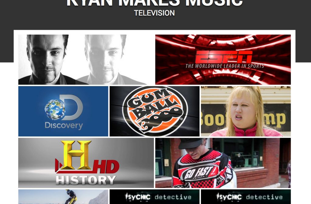
Each page eventually consisted of a mosaic of tiles representing Kyan's work through the years. On PCs and laptops the accompanying text would appear when the user rolled over each image. However, on tablets and phones (where there is no rollover state), the text appeared permanently underneath the images.

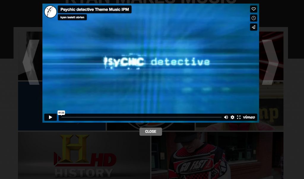
The CMS was tricky because the client needed to use a number of different external hosts for his Portfolio samples, Youtube, Vimeo and SoundCloud. Other posts only required still images and text. The CMS had to handle all of these smoothly while the design had to incorporate the different media seamlessly.

Adult Education and digital poverty in the time of Covid

Education is one of the best routes into and back into the workplace. Training, and retraining has become vital to anyone wishing to get their first job, move back into work, or simply improve their career prospects. However, because education is increasingly being delivered online, digital poverty will increasingly lead to actual poverty and vice versa.

How can communities break the cycle of digital and real poverty...

Breaking out of the loop

Vicious circles are a type of feedback loop. One negative state or process leads to a second which in turn feeds back to the first. In cases like substance abuse the spiral is clear. Abusing drugs or alcohol has multiple negative consequences, such as guilt, physical deterioration or mental and psychological impairment. These states in turn leave the addict prone to further substance abuse, and so the cycle continues unabated.

Breaking a vicious circle is simple. You just have to remove one of the negative states and the loop will collapse. The problem is that simple and easy are not the same thing.

So how does this relate to digital exclusion?

If you are actively looking for employment, digital exclusion is increasingly becoming synonymous with actual exclusion from the workforce. The kind of training which umemployed adults will need in order to re-enter the workforce is increasingly being provided online. Therefore, digital poverty prevents opportunities, which in turn leads to further digital exclusion.

If the loop is allowed to continue the problem will eventually become insurmountable.

I recently took an online test with the national numeracy advocacy charity. They are doing excellent work in a vital field. However, in order to broaden their reach, all of their tutorials and resources are online. When I asked a representative of the charity about how this effected the digitally excluded, they admitted that this was a problem that they had not yet found a solution to.

This divide between those who are online and those who are not, is only going to get worse. The only realistic solution to this problem is to reduce digital exclusion to it lowest possible level.

But how?

The World's End And Lots Road Big Local (WELR) is a charitable organisation operating in Chelsea as part of a nationwide scheme. A program whereby hundreds of places in the UK are allocated £1 million in order to improve their local area from the grassroots up. Every Big Local area gets to define their own priorities, and for WELR, Jobs and Enterprise was near the top of the list. The charity has helped many local residents to enter the workforce or to set up their own business.

In that time, skills training has proved to be one of their most effective tools. Courses have been taken in security, construction site management, cosmetic and beauty qualifications, etc...

These courses have been effective in getting people back into work and off assistance. For any local area, a reduction in unemployment is hugely beneficial. Increased employment means a reduction in anti-social behaviour, more opportunities for local businesses, and above all a positive change in culture.

Our latest course, which as been taking place during lockdown, has been a combination of online and classroom learning.

The problem is the online part of the course. The exclusion has three aspects. Firstly there is a lack of access to decent broadband. Secondly is access to up-to-date technology. However, the third and most insidious problem is a lack of basic skills.

For someone like myself, who entered the workforce only a couple of years before PCs started to enter the office, the accumulation of computer and IT skills was simply a matter of turning up for work. I acquired those skills as I went along. I was never presented with a steep learning curve.

That's not the case for those who are currently digitally excluded. From their perspective it's like boarding a fast moving train.

So what do we do?

As is always the case, we do what we can. If you have reusable technology, donate it. If you have skills, teach them. If you have spare broadband, make it available.

But most of all, do it kindly. Learning curves can be terrifying, and the feeling that everyone else is on board with something and you are getting left behind can be crippling. But the potential rewards are phenomenal. Families brought closer together, skills and confidence gained. Jobs applied for and gotten. Lives can be enriched and changed for the better.

Table tennis, cheating, and why smug pedants have no business being referees

It's a Saturday (pre-Covid) and it's too early in the morning to be up and travelling. The weather is awful and I am heading to Edgware to referee rounds 9 and 10 of Division 3 of Senior British League Table Tennis.

In Table Tennis Umpires oversee individual matches and Referees oversee tournaments as a whole. Referees rarely get involved in matches except to arbitrate on points of law or to sanction players.

When you are a match official, it should never be about you.

An umpire has yellow and red cards, which they can issue to players along with penalty points. However, they cannot dismiss that player, not without involving the referee. After three card-worthy infringements they must suspend the game and appeal to the Referee. The Referee can then make a decision as to whether the player can continue or not. This system works perfectly well as long as you have both umpires and a referee at the event.

So what if you don't?

This particular event involved 8 teams. Each match pitted one team against another in eight singles and one doubles match, played sequentially on a single table. The problem with lower-level tournaments like this is that its virtually impossible to get umpires to help out. Umpires are volunteers and normally just get expenses. The vast majority of people in the table tennis community are either playing or have better things to do on a weekend. Larger, more prestigious tournament will attract a decent array of volunteers, but not this one.

Umpiring also tends to be a thankless task. Overseeing a match where both players are honest and don't break the rules is tedious, whereas umpiring a game where players are cheating players can be stressful. Those are your choices: boredom or aggravation. Moreover, if you get everything right you are anonymous. If you ever do get noticed it's usually for all the wrong reasons.

Referees are different. You cannot have a tournament without a referee. Umpires, on the other hand, are optional, and without them players from each team take turns officiating matches. This is where it can get problematic.

Most players are not qualified umpires and often they don't understand the minutiae of the rules, particularly the rules governing the serve. It tends not to be a problem as most players are honest and deliberate infractions of the rules are rare. But there are those players who are determined to cheat and an even smaller minority who are downright abusive when confronted about it.

The majority of table tennis players - at all levels - are ultra-competitive but only within the rules. There are those who break the rules out of ignorance, like one competitor I encountered who was repeatedly hiding the ball from his opponent while serving. He had no idea that he was doing it or that it was illegal in the first place. Nevertheless, it was still an infringement and had to be penalised.

Most rule-breaking in table tennis takes place during the serve, mainly because the service rules are so complicated. There are stipulations about how the ball is held; where the ball is held; how it is thrown up; how high it must go; whether or not your opponent can see the contact of your racquet and the ball; Where the contact is made (it must not be directly over the table), etc..

Most players who infringe these rules are not doing so deliberately. They never get called on when they play at their clubs, or at lower level tournaments. Even as they progress to higher levels they may come across umpires who are overly lenient.

The problems come when they come up against an umpire who is willing to call fault on their serves. I have seen players games fall apart completely because they have never learned to serve legally and cannot do so when required.

My advice to younger players is to correct any illegality in their service action sooner rather than later. You don't want to have to change your serve half through the most important match of your life.

Cheating or rule-breaking is only half of the issue. The other half is personal abuse. Aggressive behaviour comes from a couple of different places. It's often the result of that player trying to cope with the stress of the match.

People outside of the sport tend to think of table tennis as a recreational thing. All sorts of people playing in youth clubs or coffee shops or public parks. Most people would be amazed at the sheer intensity of any league match.

Most players – even at this level – are ultra-competitive and that, along with the quality and proximity of their opponents, can lead to real pressure cooker situations. That kind of aggression is the easiest to deal with because you can simply let the player blow themselves out. They can rant for a moment, but once the see that you are not going to be moved by such displays, they usually calm down and get on with it.

The second reason they can get abusive is the simple fact that you appear to be accusing them of cheating. They may be breaking the rules out of ignorance rather than design, but it still sounds - to them - like an accusation that they are being dishonest.

Most people tend to think of themselves as good people so being accused of cheating (even when they have been) is hard to stomach. This tends to get exaggerated by the sheer cognitive dissonance that must arise from simultaneously being a cheat and denying that you are one.

The final kind are the bullies. These are the players who really have only one question for the official. Are you weak? Are you the kind of ref or umpire who is easily intimidated. If they shout and rant or argue endlessly, it is only to see if it has any effect on your decision making, and if you let it have any effect then you are done. Their behaviour will only get worse because you are rewarding it.

I would be lying if I said that abuse has no effect on me. It does. My instinct when people get in my face is to push back. This would not be helpful either. Losing your cool as an official is the ultimate sin. You are there for one reason and one reason only, to see that the rules are in effect throughout a match. Players can give you plenty of reasons to react but no reason is ever good enough. You just don't lose your cool.

This would only put more pressure on you and ironically would give the trouble makers genuine reasons to question your competence.

Punishing a player for their obnoxious behaviour would be even worse than giving in to it. If you favour a player simply to avoid the grief that they bring then you are giving them an unfair advantage. On the other hand, if you punish them for their behaviour, you are giving in to your ego and inserting yourself into the narrative of the match. In the first case you are being a bad official, in the second you have stopped being an official at all.

Either way you are not doing your job.

A thought about inserting yourself into the narrative

I have seen this occasionally when watching football, particularly in the 90s (during the early days of the Premiership). Referees were becoming nationally recognised figures and some of them simply couldn't deal with it, letting their egos run away themselves.

The worst of these was David Elleray, a north London school teacher who saw fit to award himself the title of Britain's Senior referee.

Smug and pedantic, Elleray frequently saw no problem with inserting himself into a match's narrative. This level of egotism leads to terrible performances. The worst of these was the 1997 FA cup semifinal between Chesterfield and Middlesbrough, where a series of terrible decisions by the ref determined, wrongly, the course of the match. To this day Chesterfield were almost certainly denied a historic trip to Wembley thanks to Elleray's weird determination to be front and centre of the days events.

The best match officials are anonymous. The very best are the ones you have never heard of. The one who maintained that  anonymity despite having to make the bigs calls amidst all the pressure that the biggest occasions can bring.

For me, the ultimate goal is total anonymity. When I am officiating a match, i would prefer it if people didn't know that I existed.
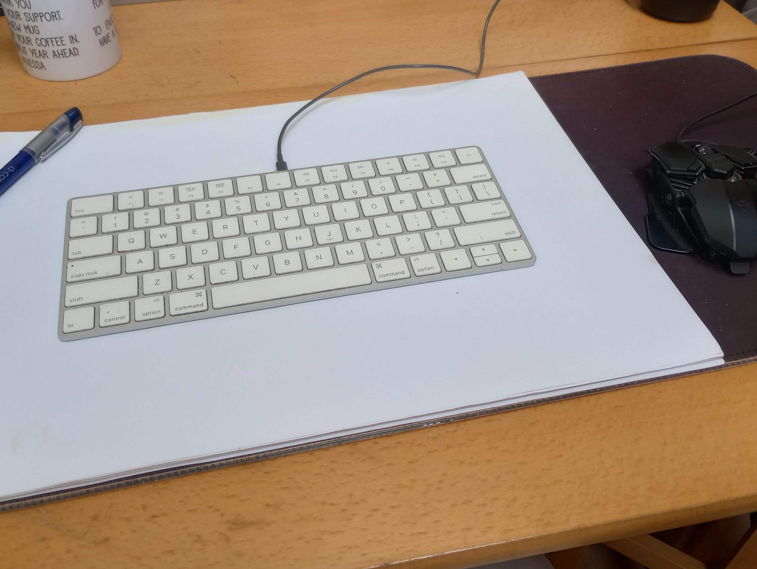
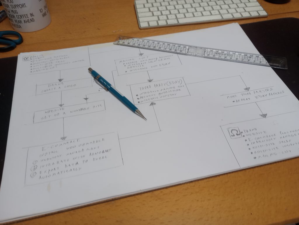
Setting up a community sports league from nothing

Jon Kaufman is a legend in UK sport. Unfortunately it's in the wrong sport. Jon is the most successful Table Tennis club manager in England. His club London Progress were British Senior Premiership champions for 10 years in a row.

The idea was simple: tournaments for people who don't play tournaments.

Since moving on from club management a decade ago, Jon has concentrated on blogging and working in various West London schools as a coach. However, both his organisational skills and ambitions remained. In the Autumn of 2018, he came to me with an idea.

He wanted to create a London Table Tennis ranking scheme. A series of tournaments that would cram as many people as possible into a hall to experience the adrenaline rush of actual competition.

However, unlike other tournaments, these would be open to all.

Potential participants could be very young kids who were learning the game but were nowhere near basic tournament level. It might be adults who used to play as kids but gave it up years ago. It might be parents of regular tournament players who were used to coming as spectators, but who might want to scratch that competitive itch.

The philosophy boiled down to this: there should be absolutely no barriers to entry. Players could be of any standard. Their equipment could be as basic as possible. Above all, they did not have to be registered with Table Tennis England, which is a requirement for almost every other tournament. Finally, the events should be affordable. The whole point was to broaden participation as far as possible.

The problem was that nothing like this existed. If we were going to do this it would have to be done from the ground up. Happily, Jon had a number of soft assets at his disposal. His real legacy at London Progress wasn't its overflowing trophy cabinet. It was the network of players, coaches and managers who had all grown up in the club. Especially those players who had moved on to forge their own identities and carve out their own success stories. In particular he was able to draw on the help of Bhavin Savjani at the London Academy in Edgware, and Jason Sugrue at the Greenhouse Centre in Marylebone.
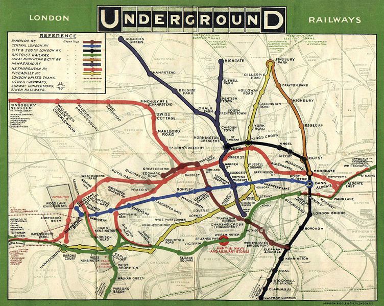
These London Progress alumni had access to players, resources, and most importantly venues. Spaces which they were generously prepared to put at our disposal for little or no cost. They also provided access to a ready made pool of players at various levels of ability.

The first tournament was put together in a rush. This was deliberate. Where new projects are concerned, Jon's philosophy is to generate as much momentum as you can, as soon as you can, and then just run with it.

It worked, sort of.

We ended up with 200 hundred players in a hall playing on 30 tables in six different talent bands. Each band acted as its own mini-tournament. Players were divided into groups and group winners went on to the knockout stage. The bands were divided on ability alone, not age nor gender. I have watched as an 11 year old girl beat a man in his mid-50s. I saw a top 30 UK senior player playing next to a couple of callow youths. I saw a woman of retirement age playing defence against an attacking player more than 50 years her junior.

It was a big success, but it was exhausting to plan, advertise and execute. So exhausting that it had seemed to me that it had absolutely no future.

This was a tournament being run on 20th century lines. People were phoning through their entries, or they would turn up at practice sessions with half a dozen scribbled sheets. Nothing was online, data was non-existent. Communications were haphazard, to say the least.

Advertising the tournaments involved travelling to clubs and public tables and trying to sell the idea to people one at a time. It was labour intensive and inefficient and frankly a pain in the neck. There was no way either of us was going to last long doing it this way.

What we needed was a number of tools to reduce the labour and repetition involved. Thankfully those tools are out there. Moreover, those tools are cheap and/or free and don't actually require that much knowledge to turn them to your advantage.

Getting online

First of all we needed a website. This was easy enough. I'm a web developer but there was no way that I was spending time on this project. So using WordPress and a nice free theme solved that problem. The website was up and running in the space of a couple of days.

Secondly, and most important was a mailing list. We began to sign up people to the website's mailing service. This service was created using Mailchimp. They provide a free service up to 2,000 recipients. Our business model depended on getting around 1,000 people participating in total, so we would never need to pay for their services.

So far, our outgoings were about £10 a month for web hosting services.

Finally we needed an online booking system. This was done using PayPal. Integrating PayPal into an online ordering form can be tricky, but it works really well. The costs involved are transactional. For every ticket we sell, PayPal takes a cut. So nothing was required up front.

By the time the third tournament started, the majority of entries were coming from the website. When this was combined with the players provided by the venues themselves, we never fell short of 200 entries for each tournament. More importantly, we didn't have to work that hard to get them. Each tournament involved sending out one email to advertise it, and another later one to remind people of the date as it approached.
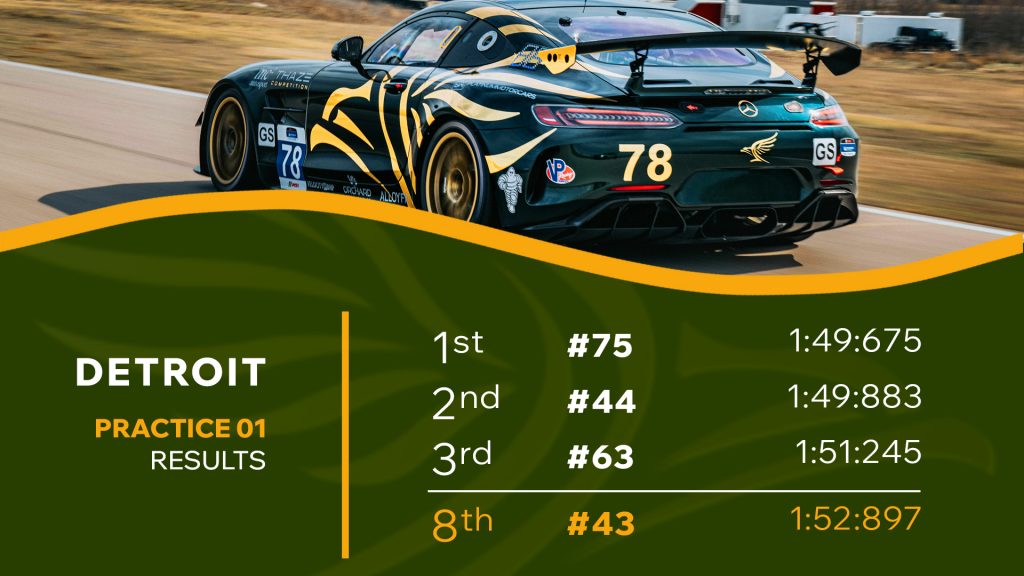
On one occasion Jon rang me to tell me to take the online form down because we had sold out a week early.

So the tournaments continued to grow throughout 2019 and into 2020. By February of this year, we had over 850 players on the rankings list and we were well on our way to hitting our target of 1,000 participants.

And then the virus hit us.

Covid 19, of course, put an end to the tournaments. Packing people into a hall like sardines was no longer an option.

However, we had proved that this could be done. we proved that there was an appetite for rough and ready community tournaments. Once the virus is gone and the world returns to some semblance of normality, we might just prove it all over again.